| Image |
Comment |
| 04/09/2004 11:34:41 AM |
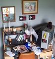
Organized Chaosby loudzgamerComment by Dave Gordon: The desk meets the challenge. I think the pictures on the wall detract from the effect; could have been cropped in to include just the desk and shelf. |
 Photographer found comment helpful. Photographer found comment helpful. |
| 04/08/2004 05:26:44 PM |
|
| 04/08/2004 04:02:41 PM |
|
| 04/06/2004 01:21:09 PM |
Organized Chaosby loudzgamerComment by mirdonamy: KROQ - Nice! :) I think the glare in the picture frames is a bit distracting and there's a bit too much lighting on the books and papers. Try backing up a bit and lighting with candle light or something colorful. Slow shutter on a tripod maybe even to increase saturation. |
| Photographer found comment helpful. |
| 04/06/2004 10:47:40 AM |
|
| 04/05/2004 11:33:44 PM |
Organized Chaosby loudzgamerComment by gerdagrice: Yep, this is a pretty chaotic looking work area. It looks almost as messy as mine. The composition of this image is, unfortunately, perhaps a bit too unorganized. There is no rela centre of interest, as far as I can see. Your camera seems to have given you some trouble in the low light situation. There is a fair amount of noise on the wall areas. |
| Photographer found comment helpful. |
| 04/05/2004 05:16:37 AM |
Organized Chaosby loudzgamerComment by Sammie: What a good picture for the challenge. I like it very much, can't think of anything you could do to improve it. |
| Photographer found comment helpful. |
| 04/05/2004 04:22:54 AM |
|
| Photographer found comment helpful. |
| 04/02/2004 08:34:49 PM |
car and driverby loudzgamerComment by dr rick: Greetings from the Critique Club!
The message
The purpose of this photo is to show off the unique features of this interesting vehicle. It's a great subject for a magazine cover and the home in the background makes a nice setting. But it's lacking in interest; another element (like a driver) or an unusual point of view would help grab the viewer's attention.
Creative choices
The lighting is harsh, but I think it works well here with the dark car, casting an even darker shadow and making nice specular highlights. The colors of the various elements work well together. The reflections in the car are subtle and nicely show off its contours.
Technical aspects
Exposure is perfect. Focus seems fine. I'm not sure what caused the diagonal lines to be jagged, but it is mildly distracting. But my main complaint about this photo is that the highlights are missing their metallic edge, making the car look plastic. I suspect this is a result of the Neat Image processing. |
| 03/30/2004 12:25:30 PM |
|
Home -
Challenges -
Community -
League -
Photos -
Cameras -
Lenses -
Learn -
Help -
Terms of Use -
Privacy -
Top ^
DPChallenge, and website content and design, Copyright © 2001-2026 Challenging Technologies, LLC.
All digital photo copyrights belong to the photographers and may not be used without permission.
Current Server Time: 07/16/2026 04:57:34 PM EDT.