| Image |
Comment |
| 08/13/2015 04:43:04 AM |
|
 Photographer found comment helpful. Photographer found comment helpful. |
| 08/05/2015 06:05:49 AM |
Duck Truck MTLby clickodakComment by sidpixel: *Hello from Sid and the Critique Club*
A competent image that only partially meets the challenge
Your image is technically sound with sufficient DOF and no camera shake and you have thought about including sufficient detail to identify the truck and its speciality of duck and the human element of a lady purchasing food, so to that end it has everything needed. What it does not do is to convey in me a feeling that this is specifically summer food, I could of course be wrong but duck is eaten all year round and it could just as easily be seen there in the middle of winter. I think for the challenge there needs to be more of an emphasis on that which identifies it as being summer related.
From your shooting position you have cropped it as much as you can but I think a shallower DOF would have isolated the distracting background detail more and you have plenty of scope for that with your fast lens. I have to say that there is not really much to make the viewer linger here for very long it might have been better if we saw the dish she is waiting for but in terms of the challenge it doesn't quite make the mark.
Thanks for your submission, Sid |
| Photographer found comment helpful. |
| 08/05/2015 01:25:20 AM |
Bike Ride to Happiness by clickodakComment by taterbug: Ok, maybe a little soft...and perhaps not a great background...but sometimes the shot captured can overcome some basic flaws. This is definitely the case here. I like it! For sure brought a smile to my face, and what better compliment than an image that invokes emotion. Great shot :-) |
| Photographer found comment helpful. |
| 08/05/2015 12:29:06 AM |
|
| 08/02/2015 08:18:05 AM |
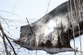
Forest firesby clickodakComment by sidpixel: *Hello from Sid and the Critique Club*
A very intriguing image that meets the challenge.
As with the other submissions I've critiqued for this challenge, I have to begin by admitting that I am not familiar enough with JJBeguin's work to be able to comment with any authority, however, I will do my best. Your comments are a good guide as to his and your aims with your work, thank you.
I have to say that after the initial confusion which made me look harder and then to see and appreciate better the image itself, I like what I see, I find it quite fascinating. You have done well to find the scene and transform it the way you have. quite simple yet effective. I love the shapes and the reflections and the eventual giveaway of the upside down nature of what we're looking at. Your exposure is good, you have got the snow white without too much sacrifice of the water's highlights, though I detect a blue tint that might benefit from some white balance correction.
I like your composition it works very well indeed and so to do the people here, a very respectable score for a very respectable entry, well done Sid. |
| Photographer found comment helpful. |
| 07/30/2015 09:33:30 AM |
|
| Photographer found comment helpful. |
| 07/27/2015 10:55:25 AM |
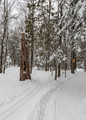
You Name It........by clickodakComment by sidpixel: *Hello from Sid and the Critique Club*
A well executed image that meets the challenge.
A fun challenge that gives you complete free reign without even having to think of a title. Wouldn’t it be nice if all challenges generated this amount of response from the viewers! Haven't you generated a lot of responses and despite that your own suggestion wasn't used.
I very much like the fact that you probably had to use +EC to get that snow looking the way it should do – white! Well done. Too often the whites of snow come out a horrible murky grey through too little thought and effort. I like the focal point of the foreground stump of a tree, I rather wish the orange sign wasn't there in such lovely natural surroundings. I like the way the snow trails lead us into the forest.
So, I reckon you want a tile from me? What about
eeny, meeny, miny, mo…
Sid |
| Photographer found comment helpful. |
| 07/27/2015 01:24:46 AM |
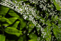
Watering Flowersby clickodakComment by quiche: Nicely sparkly. Might be a bit stronger if you cloned out some of the smaller light spots that look more like dust than water. |
| Photographer found comment helpful. |
| 07/25/2015 05:30:47 AM |
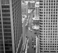
Downtown street before daily trafficby clickodakComment by sidpixel: *Hello from Sid and the Critique Club*
A literal translation of the challenge theme that meets the challenge
It makes a change to be looking down on the street instead of from the normal street level looking up at the tall buildings so it makes for an interesting perspective. Your composition is good with the two blocks framing the street which is closed by the building at the top of the frame.
I'm sorry to say that the one thing that really lets it down is camera shake, there is softness throughout what ought to have been a very crisp and sharp image. I also think you missed a great opportunity to transform it into a much more dynamic image with your camera well supported and a slower shutter speed, probably about 1/2s. You could have made a feature of the motion of the traffic and people and emphasised how the city is always on the move against the permanently static buildings.
With a little more thought and attention to detail you would have improved the end result significantly, all part of the learning process, good luck with your future submissions, Sid |
| Photographer found comment helpful. |
| 07/24/2015 06:04:36 AM |
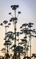
Sunset on the Anthriscus sylvestrisby clickodakComment by sidpixel: *Hello from Sid and the Critique Club*
A reasonable attempt that meets the challenge
I am a great fan of contre-jour lighting which as you observed can bring out details previously unnoticed it can however, present you with exposure problems. The camera meter has done the best it can and averaged out everything so what you end up with is something in between two camps neither of which gives you the best result.
I would have used some minus exposure compensation (-1 EC) probably 1 stop this would have created silhouettes of the flower heads which being such distinct shapes would work well, it would also saturate the background sky which given your title would probably be nearer to what you intended. Alternatively, +1 EC would have exposed the flowers themselves at the expense of a washed out sky which is, in my opinion, the less effective option.
There is not much going on in terms of composition, there is no strong focal point and too much going on in the lower half of the frame. Simplicity would have been much more effective, if you were to crop with the main flower to the left of the frame excluding everything up to it down to the top half of the flower to its lower right you would have a much simpler more effective composition that would have a lot more impact.
You might try the suggested crop together with lower exposure to a silhouette? Sid |
| Photographer found comment helpful. |
Home -
Challenges -
Community -
League -
Photos -
Cameras -
Lenses -
Learn -
Help -
Terms of Use -
Privacy -
Top ^
DPChallenge, and website content and design, Copyright © 2001-2026 Challenging Technologies, LLC.
All digital photo copyrights belong to the photographers and may not be used without permission.
Current Server Time: 07/19/2026 03:45:25 AM EDT.