|
|
|
Showing 961 - 970 of ~1480 |
| Image |
Comment |
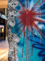
| 09/03/2015 08:36:01 AM | Berlin Wallby clickodakComment by sidpixel: *Hello from Sid and the Critique Club*
An interesting image that fulfils the challenge perfectly.
There can be no mistake that this most certainly is a huge lump of concrete, but not just any old concrete, it is a very important part of recent history. It is brought alive by the colourful graffiti and your title during the challenge and post challenge with your very helpful comments.
I know one of your commenters likes the inclusion of the background, I am not so keen, or rather I love the irregular left edge of the concrete and this should be preserved by the inclusion of a minimal background, I think where the brown structure becomes black would have been the ideal amount to include and I would have dodged or cloned the part of the canopy that would intrude to make it more uniform. The bright lights of bokeh in the window are very distracting and spoil the overall result especially as we are excluding some more of the lovely graffiti on the right. The positioning of your red sunburst is good.
Nicely done, thanks for your submission and apologies for the delayed critique, as they say, 'better late than never', or at least I hope it is, Sid |  Photographer found comment helpful. Photographer found comment helpful. |
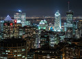
| 08/31/2015 08:58:54 AM | Nightlife downtownby clickodakComment by sidpixel: *Hello from Sid and the Critique Club*
An excellent night cityscape that contributes well to this open challenge.
The detail throughout is excellent, there is certainly plenty to grab your attention and therein lies a problem in that there is not one specific focus point but several equally competing for attention.
That is one good steady tripod you have there! The DOF and clarity of detail is a key element of your image and by taking the shot on a dark night as you have we can even pick out detail in individual windows. It has created a kaleidoscope of bright sharp detail that is a pleasure to observe, well done Marcel.
Apologies for the late critique, but as they say, better late than never, Sid | | Photographer found comment helpful. |
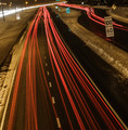
| 08/29/2015 01:37:23 PM | Exceed speed limitsby clickodakComment by sidpixel: *Hello from Sid and the Critique Club*
An interesting image that meets the challenge well.
Ah, the things we have to do for our craft! Well done and thanks for enduring the hardships, your image is very well composed. I like that you have gone for the red light dominating the image with the bright headlights clearly an evident but insignificant element overall. Its also enabled you to get the road signs well illuminated. The tilt adds a quirky element to the overall result. All in all, a good effort, well done marcel.
Apologies for the delayed critique, as they say, better late than never, Sid | | Photographer found comment helpful. |
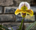
| 08/27/2015 01:40:38 PM | Waiting pollinatorby clickodakComment by sidpixel: *Hello from Sid and the Critique Club*
An appealing floral study that meets the challenge.
Your focus is clearly on the flower and your DOF is appropriate and the off-centre composition works well. I see one of your commenters has remarked about over-exposure, persoanlly I think you have taken it just about as far as is acceptable but by doing so you have got better whites with little or no loss of detail, which for me is fine. You do have some chromatic aberration on the white petal, there is green/blue fringe all round the edge, this ought to be rectified in ACR
Please forgive the long delay in this critique, I hope you feel the image and critique are both still relevant, Sid. | | Photographer found comment helpful. |
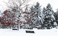
| 08/26/2015 05:07:01 PM | December parkby clickodakComment by sidpixel: *Hello from Sid and the Critique Club*
An appealing image that meets the challenge.
I love the high contrast you have here, some lovely whites, even though I think you have probably taken them a little too far there is a significant loss of detail but this, I think, is one of those rare occasions where it works to your advantage. I particularly love the foreground tree with its stark contrasts and the hint of red leaves against the near mono totality of the rest of the image.
Your composition is good with the foreground tree on the left and the back of the benches breaking up the whites. The DOF is also appropriate, there is no obvious evidence of camera shake from the slow shutter speed but there is a uniform softness that adds to the overall appeal.
I like everything you've done here, its an excellent submission, well done Marcel, Sid | | Photographer found comment helpful. |
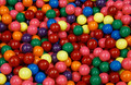
| 08/25/2015 11:53:40 AM | Tiny Bubble Gumsby clickodakComment by sidpixel: *Hello from Sid and the Critique Club*
A very colourful image that meets the challenge.
I'll be honest I've never actually seen bubble gum like this but I've probably led a very sheltered life! You have certainly captured and eye-catching image that just shouts 'look at me'. The colours are very striking.
You have a good DOF through most of the image bit it is just a little soft at the top. I assume you have used a tripod, although you have a slow shutter speed there is no evidence of camera shake. The highlights are good though the yellows are close to blown they seem paler and the whites whiter, perhaps some -EC would have overcome that and saturated the rest of the colours more too.
An excellent entry, thanks Sid | | Photographer found comment helpful. |
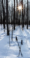
| 08/25/2015 07:52:45 AM | Winter hikeby clickodakComment by sidpixel: *Hello from Sid and the Critique Club*
An interesting shot that I am unsure it meets the challenge.
Well, I must admit, I am completely confused by the validity of your entry, perhaps as well it didn't win! I think to be successful in a challenge of this nature those that have the most obvious omissions are the ones most likely to succeed, or at least get most attention. So, it was well guessed by one of your commenters but I really enjoyed Yo_Spiff's comment, I hope he wasn't right!
So, let's talk about the image itself. It's a shame it wasn't virgin snow but I do like the backlighting and shadows and your crossed poles in the foreground, I also like the near silhouettes of the trees. I think there is potential here to give the image more impact through increased contrast by giving the snow more exposure to get it whiter and reducing exposure on the tree trunks to make the silhouettes, I think it could make for a more interesting result.
Anyway, your secret's safe with me! Tee hee, Sid | | Photographer found comment helpful. |
| 08/25/2015 05:50:41 AM | Hands playing Classical guitarby clickodakComment by sidpixel: *Hello from Sid and the Critique Club*
Congratulations for your high placing with this most appropriate image for the challenge.
Is this a self portrait Marcel? If so, you are a multi talented man, well done. This is an excellent image, your chosen aperture is creating a nice centre of focus on the playing hand, the composition is very good with a nice diagonal running through the image. I know you do concern yourself with composition and have asked for help in the past, have no fear, you most definitely got it right here Marcel, it works perfectly.
I like the lighting and the mono processing it works very well here. There is an argument for making the chords hand the centre of focus which I think would also work very well, but the argument is equally strong to do as you have done as this is the hand from which the sound emanates. The few minor blemishes on the front of the guitar would benefit from some processing attention but its certainly not a major issue.
Well done Marcel, this is an excellent entry in every respect, Sid | | Photographer found comment helpful. |
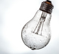
| 08/23/2015 07:23:22 AM | Frozen Lightby clickodakComment by sidpixel: *Hello from Sid and the Critique Club*
An original image that meets the challenge well.
I like your concept it it fits the challenge very well and your composition is very good, well done. The angle of the light, the very slight cropping and its position within the frame are all ideal for the subject. I like the ice and the water on the bulb it works very well adding another intriguing element to the image.
What I am not so keen on is the background, I wish it were a more uniform white throughout it would give the image even more impact than it already has. Having said that there may well be people here who prefer it this way, that is just my personal preference.
I think you have done a great here Marcel, thoroughly deserving of your high score and placing, well done, Sid | | Photographer found comment helpful. |
| 08/23/2015 07:00:23 AM | Once upon a time....by clickodakComment by sidpixel: *Hello from Sid and the Critique Club*
A cute image but does not meet the challenge.
The concept is cute and very appealing having the two teddies reading the book together tugs at the heartstrings and makes you go into soft mode! However, the execution could have been better, I don't think the focus is soft as your commenter has observed but the problem is a lack of sharpness which is due to camera shake. It may be that you used a tripod, I don't know, but at these sort of speeds unless you use a remote release you will introduce camera shake as soon as you press the shutter release. A way round this if you don't have a remote is to use the camera's self timer.
Your exposure is good and I like the chosen aperture and focus point on the eyes, I like the way the book in the foreground is in soft focus enabling us to focus on the bears themselves.
A very appealing image Marcel, sorry it didn't score higher for you, Sid | | Photographer found comment helpful. |
|
Showing 961 - 970 of ~1480 |
Home -
Challenges -
Community -
League -
Photos -
Cameras -
Lenses -
Learn -
Help -
Terms of Use -
Privacy -
Top ^
DPChallenge, and website content and design, Copyright © 2001-2026 Challenging Technologies, LLC.
All digital photo copyrights belong to the photographers and may not be used without permission.
Current Server Time: 07/19/2026 08:17:47 AM EDT.
|