| Image |
Comment |
| 10/22/2015 07:19:39 PM |
|
 Photographer found comment helpful. Photographer found comment helpful. |
| 10/22/2015 01:05:54 PM |
|
| Photographer found comment helpful. |
| 10/22/2015 08:22:12 AM |
|
| Photographer found comment helpful. |
| 10/21/2015 10:54:19 AM |
|
| Photographer found comment helpful. |
| 10/20/2015 01:37:37 PM |
|
| Photographer found comment helpful. |
| 10/20/2015 05:15:46 AM |
|
| Photographer found comment helpful. |
| 10/19/2015 06:38:43 PM |
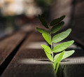
Power of the Sunby clickodakComment by snaffles: Greetings from the Critique Club!
I can see where you're going with this, Marcel, and this kind of image is quite a popular metaphor for strength - the tiny little plant forcing its way up through a huge rock and perhaps even splitting it asunder (although very slowly) as it grows. Clearly the sun is playing a major part here but in this case, in terms of light, sadly it isn't helping very much. The top part of the plant is in shadow, the exposure on the leaves immediately below the shadows is quite good, but the rest of the plant is a little flat, there is no sense of depth and dimension which gives life to a photo. I'm guessing the sun was a little high in the sky?
Comp is quite basic and works for the simplicity of the shot. I was surprised to see that this was shot at f.5, I would have thought it was a stop or two down like f2.8. I think the bokeh works. If only the sun had cooperated a little more, in a couple more hours' time or so (esp at this time of year) when the light was lower and perhaps shot so the plant was backlit and glowing...that's what voters wet their panties over ;-)
Hope this has been helpful, feel free to pm me with any questions.
Susan |
| Photographer found comment helpful. |
| 10/19/2015 10:45:59 AM |
|
| Photographer found comment helpful. |
| 10/18/2015 12:18:24 PM |
|
| Photographer found comment helpful. |
| 10/14/2015 08:43:13 PM |
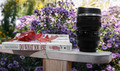
Do what you areby clickodakComment by snaffles: Greetings from the Critique Club!
I can see what you're trying to do here, Marcel, but only after reading your explanation in Photographer's comments. It's just a bit too obscure - some maple leaves on a book with a lens nearby. Comp is a little careless, nothing really blends and flows together. This looks like a shoehorn entry, a shot just to have something to enter. Hey, I've shot my share of shoehorns so I know what I'm talking about!!:-)
I'm sure the book is a great read and I will look for it at my local library, but if you want to help promote the book or the idea that it helps to find your career through your personality type...that's a very tough one to shoot without a lot of thought and planning beforehand. It's a fairly abstract idea and most challenges here are relatively concrete concepts.
Feel free to PM me with any questions
Susan |
| Photographer found comment helpful. |
Home -
Challenges -
Community -
League -
Photos -
Cameras -
Lenses -
Learn -
Help -
Terms of Use -
Privacy -
Top ^
DPChallenge, and website content and design, Copyright © 2001-2026 Challenging Technologies, LLC.
All digital photo copyrights belong to the photographers and may not be used without permission.
Current Server Time: 07/20/2026 03:53:02 AM EDT.