| Image |
Comment |
| 02/01/2016 07:09:31 PM |
In God we Trustby clickodakComment by gipper11: I like the depth of field, the composition and the focus but I think the penny needs a little more contrast or saturation. |
 Photographer found comment helpful. Photographer found comment helpful. |
| 02/01/2016 02:55:44 PM |
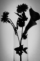
Aquariumby clickodakComment by snaffles: Greetings from the Critique Club!
So we meet again, Mr Marcel...and yes, it is a nice silhouette, but I honestly missed seeing the fish altogether in voting. I only just saw it now because the flowers are very dominant, and they overwhelm the poor little fish! And visually it looks like the fish has been run through by the flower stem. And, the way the fish's body is blocking the stem, it also stops the eye from continuing down the stem to the bottom. I can see where you wanted to go with this, and I applaud you for it, but sometimes it's best to just simplify - either the flowers or the fish, but not both.
Hope this helps
Susan |
| Photographer found comment helpful. |
| 01/31/2016 07:58:08 PM |
|
| Photographer found comment helpful. |
| 01/31/2016 06:11:26 PM |
Aquariumby clickodakComment by Phocal: Perfect example of what a silhouette should be but just a bit uninteresting as a photograph for me. |
| Photographer found comment helpful. |
| 01/28/2016 07:56:51 PM |
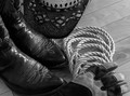
Cowboy accessoriesby clickodakComment by snaffles: nice macro but having seen a lot of real, working cowboys, I know that none of these accessories shows anywhere near the real wear n tear they put on their gear! And they use polyrope these days |
| Photographer found comment helpful. |
| 01/28/2016 01:26:33 PM |
Cowboy accessoriesby clickodakComment by gipper11: I like the country theme, nice focus, there are some dust spots on the boots that could have been edited out to make it look even better. Nice composition. |
| Photographer found comment helpful. |
| 01/27/2016 06:24:27 PM |
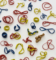
Rubber Bandby clickodakComment by snaffles: Greetings from the Critique Club!
Oh, Marcel, I am afraid that this is a little bit of a misstep. Technically it's quite a good image, well lit, with well-defined rubber bands (though some in the bottom third or so are getting soft), but it's simply too literal, and at this stage in his career, Bowie was not literal in his lyrics. The multitude of bands leads the eye all over the place, it needs to stop and settle somewhere. It may have been a better idea to read the lyrics and try to illustrate a line from the song, or if really stuck, go with a better known song.
I did say that this was a misstep but you're definitely on a journey! Keep up the good work and keep on entering.
Susan |
| Photographer found comment helpful. |
| 01/27/2016 12:05:49 PM |
|
| Photographer found comment helpful. |
| 01/22/2016 02:32:47 PM |
Watch your step !!!by clickodakComment by sidpixel: Hello from the Critique club
An appealing image that meets the challenge
At first I thought this was the same image as you won your yellow with Marcel, which effectively it is but a slightly different version. I can understand why you would want to do this given your previous success but these sort of challenges are in themselves very challenging and best met with an image that you consider to be your best as opposed to a DPC most successful. This image lacks the impact of your other in terms of processing, the mono tones and contrast are too limited. The image rotation of your other created an illusion and interest that is sadly lacking here. I think you could have tried something a bit more creative with a panoramic crop of the lower half of the shot with a much brighter background with burnt in shadows which would have given you something very different, perhaps you might try it and see what you think?
Well done, thank you for your entry.
|
| Photographer found comment helpful. |
| 01/21/2016 03:18:46 PM |
|
| Photographer found comment helpful. |
Home -
Challenges -
Community -
League -
Photos -
Cameras -
Lenses -
Learn -
Help -
Terms of Use -
Privacy -
Top ^
DPChallenge, and website content and design, Copyright © 2001-2026 Challenging Technologies, LLC.
All digital photo copyrights belong to the photographers and may not be used without permission.
Current Server Time: 07/23/2026 02:54:09 AM EDT.