| Image |
Comment |
| 04/27/2005 08:19:37 AM |
|
 Photographer found comment helpful. Photographer found comment helpful. |
| 04/27/2005 01:20:37 AM |
|
| Photographer found comment helpful. |
| 04/27/2005 01:07:50 AM |
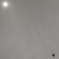
Flightby rookComment by Gringo: This is one of the few pictures on DPC that actually have a purpose for being under-sized. this works well to help push the "Minimalism" theme. Great composition all the way around. 9 |
| Photographer found comment helpful. |
| 04/19/2005 05:45:55 AM |
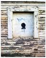
Boarded Upby rookComment by Brad: Interesting artistic interpretation to the challenge with the artwork on the boarded-up window. A bit on the contrasty side and a slightly lower point of view (shooting angle) woud have helped the lower boards be a bit more horizontal. (4) |
| Photographer found comment helpful. |
| 04/18/2005 11:04:12 PM |
Boarded Upby rookComment by Evaan: I like this shot very much. I wish it were more sharp, though. Nice cropping. |
| Photographer found comment helpful. |
| 04/18/2005 07:29:15 AM |
Boarded Upby rookComment by notonline: The contrast in the picture is a little bright and makes the picture looked a bit washed. I also think your shot should have included more of the building instead of just a window. I do however like the paint peeling off the buildings exterior and think it adds to the picture. Good luck in this challenge. |
| Photographer found comment helpful. |
| 04/15/2005 04:16:28 PM |
|
| Photographer found comment helpful. |
| 04/14/2005 07:34:33 PM |
Boarded Upby rookComment by ReallyColorBlind: Not really my idea of a building composition. I think you focused too much on the window frame. I do like the detail in the chipped paint. For what you have, you balanced the light and dark pretty good. |
| Photographer found comment helpful. |
| 04/13/2005 03:22:47 PM |
Boarded Upby rookComment by srbrubaker: The strength of the photo would have been the beautiful texture of the peeling paint, IMO; but it all seems a little out of focus. It's hard to argue that the composition is strong. Or that the lighting is unusually good, although I notice some pleasing soft shadows. I'm afraid the blued-out face sort of ruins what little attraction the peeling paint had - might have been interesting before it was 'defaced.' |
| Photographer found comment helpful. |
| 04/13/2005 01:21:18 AM |
|
Home -
Challenges -
Community -
League -
Photos -
Cameras -
Lenses -
Learn -
Help -
Terms of Use -
Privacy -
Top ^
DPChallenge, and website content and design, Copyright © 2001-2026 Challenging Technologies, LLC.
All digital photo copyrights belong to the photographers and may not be used without permission.
Current Server Time: 07/17/2026 02:05:28 AM EDT.