| Image |
Comment |
| 02/29/2004 10:27:53 AM |
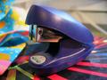
THE STAPLERby clarinet00Comment by banmorn: Is it? Yes it is a stapler....sorry but it looks like a stapler and the image is not really extraordinary. |
| 02/28/2004 02:08:58 PM |
|
| 02/28/2004 05:51:32 AM |
THE STAPLERby clarinet00Comment by Olyuzi: DOF a bit too narrow, I would have liked to have seen the entire stapler in focus. Lighting is too harsh and there is too much happening colorwise. Way too busy. In addition, I would like to have seen a different angle of view as you can see the distant background of the room in the upper right hand corner. Highlight in upper left is blown out. |
| 02/27/2004 12:13:30 AM |
|
| 02/25/2004 05:11:07 AM |
THE STAPLERby clarinet00Comment by andywightman: Excellent subject. but, need to polace against a neutral background for maximum effect (existing background is very distracting). Also, need to have whole of paper clip in focus and experiment a bit more with lighting - notice the harsh glare off the top of handle. |
| 02/23/2004 09:45:50 AM |
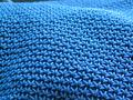
Purseby clarinet00Comment by drgsoell: You got the weave quite well and even made it look kind of like rolling hills. Plus, I love the color. |
| 02/22/2004 09:01:03 AM |
Purseby clarinet00Comment by soccerdad: This certainly meets the “texture” part of the challenge, but, it could use a single point of interest to make good use of that interesting texture as background. |
| 02/20/2004 11:13:08 PM |
Purseby clarinet00Comment by sfalice: This is a good texture shot and it meets the challenge., To make it stand out, it could be a good idea to introduce another shape or color to keep the viewer interested in your composition. Still, well exposed and good depth of field. |
| 02/20/2004 10:53:50 PM |
Purseby clarinet00Comment by gps_01: Nice photo. But I think the empty space top left and the bright area top right are a bit distracting |
| 02/20/2004 01:51:36 PM |
Purseby clarinet00Comment by relgraphics: Excellent. This is what I was going for but mine did not come out as good as yours did. 8 |
Home -
Challenges -
Community -
League -
Photos -
Cameras -
Lenses -
Learn -
Help -
Terms of Use -
Privacy -
Top ^
DPChallenge, and website content and design, Copyright © 2001-2026 Challenging Technologies, LLC.
All digital photo copyrights belong to the photographers and may not be used without permission.
Current Server Time: 07/16/2026 12:49:06 AM EDT.