| Image |
Comment |
| 09/24/2004 08:00:37 PM |
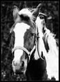
Thinkingby Ecce_SignumComment by waterlilies: I really like this profile, though I'd recommend perhaps dodging the background a bit so the horse will stand out more. |
 Photographer found comment helpful. Photographer found comment helpful. |
| 09/22/2004 05:51:38 PM |
|
| Photographer found comment helpful. |
| 09/18/2004 06:37:47 PM |
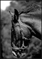
Old Horseby Ecce_SignumComment by JPR: I don't think it's the grain/noise that is the main problem although there is a little too much of it. I get the feeling that the original image itself was a bit less that nicely sharp so you tried to cover that up by making it black and white and adding noise. I do that a lot too but find it rarely works. The best grainy vintage looking black and whites usually come from sharp clean color images. :)
I still like this image though. It looks better from farther away. |
| Photographer found comment helpful. |
| 09/18/2004 04:28:27 PM |
Old Horseby Ecce_SignumComment by skylen: Nice B&W pic. I think the main problem is that the grain is too coarse. Maybe a finer grain and/or less amount of grain would improve it? With this much coarse grain a lot of detail is lost. |
| Photographer found comment helpful. |
| 09/18/2004 03:58:56 PM |
Old Horseby Ecce_SignumComment by kiwiness: It's a fine portrait, the composition is good, but like you say there is a little too much noise in it. |
| Photographer found comment helpful. |
| 09/18/2004 03:30:59 PM |
Old Horseby Ecce_SignumComment by waterlilies: I like the way you've framed this portrait. A lot of people (me included) feel the need to show the whole horse, or don't know where the most graceful crop would be, but you've done a nice job on this piece. He looks good in black and white because of the multi-colored nature of his coat, but I do think there's a bit much noise. |
| Photographer found comment helpful. |
| 09/17/2004 11:56:07 AM |
|
| Photographer found comment helpful. |
| 09/16/2004 09:41:26 PM |
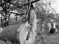
BackDraftby Ecce_SignumComment by mrorange002: candle in the wind...
yes. I'm having the same problem with voters not knowing what my shot is in the smoke challenge. i have to say, I didn't know what this was either. Good shot though,
E |
| Photographer found comment helpful. |
| 09/16/2004 09:05:35 PM |
|
| Photographer found comment helpful. |
| 09/16/2004 08:38:53 PM |
Midas (blue period)by Ecce_SignumComment by DarkRider: I hope you didn't lose your shirt on this one...LOL your comment says " I'm putting my money on this being my highest scoring sho at dpc :"
Well you kicked my butt...I tried to stay away from the obvious VP too but it got trashed. The blue is a little over processed as you already know from the other comments. I think you composition is a little too centered the triangular shapes to the right are distracting. Positioning your shot a third to the right would eliminated these shapes bringing the blue lines from the left into focal points (rule of thirds)and also allowing for more detail from the clouds in the sky. But a great subject none the less.
|
| Photographer found comment helpful. |
Home -
Challenges -
Community -
League -
Photos -
Cameras -
Lenses -
Learn -
Help -
Terms of Use -
Privacy -
Top ^
DPChallenge, and website content and design, Copyright © 2001-2026 Challenging Technologies, LLC.
All digital photo copyrights belong to the photographers and may not be used without permission.
Current Server Time: 06/11/2026 05:15:20 AM EDT.