| Image |
Comment |
| 08/08/2009 02:04:22 AM |
cieux déchirésby Ecce_SignumComment by talj: Well, it nearly hit your average ;) Think we definitely need to revisit this place when the light is on this side! I miss Mull... |
 Photographer found comment helpful. Photographer found comment helpful. |
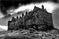
| 08/05/2009 07:20:24 AM |
Midas (blue period)by Ecce_SignumComment by spiritualspatula: It has taken us a scant five years to get to your photo, but at long last the Critique Club has dredged it back up. Being a member has its perks, I guess :)
Your entry was quite fitting for the challenge, with strong leading lines and a menacing façade that stretches off seemingly forever. The centered composition is alright, though I think I would prefer either a symmetrical approach or an uncentered composition. One thing that might have made this quite interesting visually, and likely made it border on an abstraction, would be to have shot the photo in a landscape format and then positioned the tip of the structure at the edge, but uncentered. Not necessarily on the thirds, but just so that it wasn’t centered. This would almost give the impression of a long hallway if you used the white portion for it, and the dark side would have been equally obscure looking.
As others noted, the blue is a bit intense for my taste, as well, and as you noted, you’ve got some aliasing going on there. We’ll blame that on antiquated software compression algorithms ;)
I can’t make up my mind how I feel about the fragment of cloud on the left. It’s interesting in that it seems very much like an element from an impressionist painting due to the way that it is so saturated and distinct, having very little transition of tone. The shape helps this effect too. But then it also seems a bit distracting… but balances out that side, which is lower. Like I said, can’t make up my mind.
As an aside, it’s kinda neat to get such an old image for CC, especially for a still active member. Seeing the evolution is definitely encouraging. It’s also interesting because it really shows how comparatively short a time I’ve spent here.
-Derek
|
| Photographer found comment helpful. |
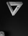
| 08/04/2009 10:06:41 PM |
Nothing is Impossible!by Ecce_SignumComment by PGerst: ** Hello from your fellow Critique Club members **
Composition
I definitely like the placement of the triangle with the point oriented downward. Not only are there distinct lines in the triangle, but the point leads to another line, one that ends at the bottom of the photo. The person in the lower left is interesting. I'm not sure if it makes or breaks the composition. The face doesn't go with the triangle, but at the same time nothing would result in too much negative space.
Technical
This photo is well lit, exposing the texture of the wood. Perhaps though a little more lighting for shadows would bring out the three dimensionality of the triangle a little more. The only issue I find is that too much of the background is visible and would be better if it was nearly black.
Very nice shot! |
| Photographer found comment helpful. |
| 08/04/2009 09:52:32 PM |
|
| Photographer found comment helpful. |
| 08/04/2009 07:49:09 PM |
oeufs en laitby Ecce_SignumComment by basssman7: Greetings from the Critique Club! Apparently it took us a little while to get to this...so I apologize for that. (hey, only a little over 3 years...)
I have seen your photography level grow by leaps and bounds since this was taken, but will still offer my opinion on this none the less. It is also rather ironic since I clicked the "take a shot at something older" in the CC que and the first one that pops up is by someone I just 10 minutes ago discussed drop shots with in a current thread!
As for the image, I think what really hurt this was the fact that the main attraction of the image (the crown from the splash) is small and also tough to distinguish from the background. I love the idea of the egg yolks to add interest and colour to the milk. I think a different background colour which contrasted with the subject...to make the subject stand out more would have helped this shot a lot. (Even though this challenge was "yellow" I think it still would have me the challenge even with a black background) |
| Photographer found comment helpful. |
| 08/04/2009 07:32:36 PM |
lumière de soiréeby Ecce_SignumComment by JulietNN: Hell from the CC club,
Gorgeous shot, almost perfection apart from a couple of little niggling things I can see. The border is rather large and does take away from the shot a little. I am a lover of dark photographs, so I am especially enjoying this one, but I do think that you should have just a tad bit lightened the horizon. If i tilt the laptop, i can see trees in the background, granted there are also some light posts and houses, but maybe just a little lightening.
excellent shot |
| Photographer found comment helpful. |
| 08/04/2009 12:39:55 AM |
|
| Photographer found comment helpful. |
| 08/03/2009 12:06:40 AM |
skullfyreby Ecce_SignumComment by Yo_Spiff: I thought this was yours. I thought it was the same skull as you used in your image grain entry. It got an 8 from me. Congrats on a nice high score and strong placement! |
| Photographer found comment helpful. |
| 08/03/2009 12:04:30 AM |
|
| Photographer found comment helpful. |
| 08/02/2009 03:50:24 AM |
|
| Photographer found comment helpful. |
Home -
Challenges -
Community -
League -
Photos -
Cameras -
Lenses -
Learn -
Help -
Terms of Use -
Privacy -
Top ^
DPChallenge, and website content and design, Copyright © 2001-2026 Challenging Technologies, LLC.
All digital photo copyrights belong to the photographers and may not be used without permission.
Current Server Time: 06/22/2026 08:58:20 AM EDT.