| Image |
Comment |
| 02/04/2004 01:51:36 PM |
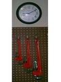
Time for Tool Timeby geschlechtmann27Comment by kaush: You could have done this in a much better way if you had only spent some time with the lighting and a few more minor adjustments. You could have atleast focused on the wrenches.
|
| 02/04/2004 01:09:44 PM |
|
| 02/04/2004 10:53:20 AM |
|
 Photographer found comment helpful. Photographer found comment helpful. |
| 02/04/2004 10:51:33 AM |
Time for Tool Timeby geschlechtmann27Comment by GoldBerry: Bad lighting [glare on the clock] and bad focus makes this look more like a snapshot than anything. Next time set up a different light source and work more on focus, and you'll have a good shot on your hands. |
| 02/04/2004 07:19:22 AM |
Time for Tool Timeby geschlechtmann27Comment by GoodEnd: Really I had only one word about it: Focus. It´s a good composition, the clock is disposable, but the three wrenchs are in good form to make a big shoot. A tip, is to try some points of view, and explore your light conditions. If the light is not good, your camera can´t do a great focus job, then try to use a tripod and manual focus. |
| Photographer found comment helpful. |
| 02/04/2004 12:58:09 AM |
|
| Photographer found comment helpful. |
| 02/02/2004 08:55:17 PM |
|
| Photographer found comment helpful. |
| 01/31/2004 08:07:33 AM |
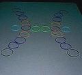
Strange Sign in a Strange Worldby geschlechtmann27Comment by nephrotic: I think the picture has suffered a lot in having its resolution cut so dramatically (obviously not your fault). I have also open the picture up in Photoshop to see what that was in the top of the frame and the top right corner. Looking at it carefully it seems that it is the edge of a table possibly (may be wrong) but I think it should have been cropped out anyway. There is also a lot of light fall-off from front to back. It would have been better if you had been able to get higher and over the rings.
I am sure some will wonder if it fits the category (cultures who do not use the standard western zodiac signs) but I am happy that it does. I think it is also an original picture. The idea was certainly worth a try. But I think it need a little more thought and some cropping would have made a huge difference.
David
|
| Photographer found comment helpful. |
| 01/31/2004 01:18:21 AM |
|
| 01/30/2004 07:54:01 PM |
Strange Sign in a Strange Worldby geschlechtmann27Comment by brett2004: This could have used a better light source - I'm not much at all for camera flash. The multi-color is a bit distracting, and the picture is very noisy (ISO too high). May have looked better in b&w or sepia. A better cropping job could have been used to even out the top portion of the picture too. Good luck! |
| Photographer found comment helpful. |
Home -
Challenges -
Community -
League -
Photos -
Cameras -
Lenses -
Learn -
Help -
Terms of Use -
Privacy -
Top ^
DPChallenge, and website content and design, Copyright © 2001-2026 Challenging Technologies, LLC.
All digital photo copyrights belong to the photographers and may not be used without permission.
Current Server Time: 07/16/2026 02:56:30 AM EDT.