| Image |
Comment |
| 09/21/2014 01:05:42 AM |
|
 Photographer found comment helpful. Photographer found comment helpful. |
| 09/20/2014 04:00:23 AM |
|
| Photographer found comment helpful. |
| 09/19/2014 03:00:58 AM |
|
| Photographer found comment helpful. |
| 09/18/2014 07:08:58 PM |
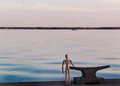
The Right Viewby KMcCComment by MadMan2k: Meets the challenge, and I like how the building darkens the sky and it shows just a little bit of the tree in the light and the rest is reflected in shadow. Really interesting overall. |
| Photographer found comment helpful. |
| 09/17/2014 02:17:40 PM |
The Right Viewby KMcCComment by aliqui: Love the reflections on the building. I believe this could really benefit from some selective color/brightness/contrast adjusting. |
| Photographer found comment helpful. |
| 09/15/2014 01:16:24 PM |
~R I S I N G ~by KMcCComment by MadMan2k: Nicely captured. I like how you can still sort of see the parts of the sun that are behind the dark clouds. I really like the look of the clouds towards the top of the frame. |
| Photographer found comment helpful. |
| 09/15/2014 11:56:24 AM |
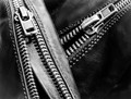
zip zipby KMcCComment by JakeKurdsjuk: Critique Club Comment:
Very well thought out image and well shot. I was one of your 6's, and the only reason I didn't give it a higher score was that I thought it was a little flat looking. I believe these are sleeve zippers from a bike jacket, correct? My issue is the lack of contrast on the top/left sleeve zipper. Your light is washing out the darkness of the leather leaving the metal from the zipper with an almost identical shade of gray. This would have been easily fixed with the burn and dodge tools in PScc. Maybe you could have tried to give some pop to the zipper heads, but the overall lack of shine to the leather makes them fit as is.
Again, a really nice image that needs some localized contrast work in post. |
| Photographer found comment helpful. |
| 09/13/2014 04:23:04 PM |
|
| Photographer found comment helpful. |
| 09/11/2014 07:43:45 PM |
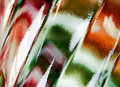
COLORATIONby KMcCComment by Jules1x: *Greetings from the Critique Club*
This was one of my favorite images of the challenge, so critiquing could be tough. I have to admit that I think you photo was highly underappreciated in the challenge. That said...
Compositionally I like what I see. The subject fills the frame. The challenge was to be abstract, and I think you hit a home run. I even see a bit of framing with the white edges, and that makes this feel like a complete image to me. The image does feel a bit flat, like a flat object was photographed - which perhaps turned some voters off? But you have a nice, abstract pattern of color going which also made the photo interesting to me.
Technically I think the image is good. The colors are lovely although perhaps the stark white 'strips' in a few places, where there appears to be a loss of detail, bothered some voters. To me that just added to the abstract element and did not take away from my enjoyment of the image at all. There might be a bit of softness to the shot, but to me again, this worked perfectly to create a wonderful abstract piece of art.
Thanks for sharing. I loved what you created.
Julee
|
| Photographer found comment helpful. |
| 09/10/2014 05:29:48 PM |
|
| Photographer found comment helpful. |
Home -
Challenges -
Community -
League -
Photos -
Cameras -
Lenses -
Learn -
Help -
Terms of Use -
Privacy -
Top ^
DPChallenge, and website content and design, Copyright © 2001-2026 Challenging Technologies, LLC.
All digital photo copyrights belong to the photographers and may not be used without permission.
Current Server Time: 06/22/2026 10:33:03 AM EDT.