| Image |
Comment |
| 05/19/2004 02:34:23 PM |
Irisby labudsComment by Mick: This is very cool! The round crop was a good idea. I hope you didn't poke somebody in the eye. :)
|
| 05/19/2004 02:01:14 PM |
Overtimeby labudsComment by C-town driver: Very cool photo. I like how it uses disconnected elements as subjects but still ties together to tell a story. The use of lighting and darkness really make an impact here. Nice work. |
| 05/19/2004 01:25:46 PM |
The Exorcistby labudsComment by Jas: hehehehe i knew it was you! with the red and the blue, of course its aleks! hehehe |
| 05/19/2004 10:48:01 AM |
Irisby labudsComment by PhilipDyer: Amazing detail. I can't wait to read what you used to get this shot. Great job! |
| 05/19/2004 03:45:58 AM |
Overtimeby labudsComment by Falc: Thats my habit too ;-)
This is a well executed image, well lit and well composed, Really hits the mark for tha challenge. |
| 05/19/2004 12:59:10 AM |
|
| 05/18/2004 11:03:33 PM |
|
| 05/18/2004 09:10:51 PM |
Irisby labudsComment by MrAkamai: This "floating" iris is a bit eerie in my opinion. Now, if it were red and slightly elongated, I'd say you have Sauron's eye from LOTR! Nice job capturing the colors and fine details and focus is excellent. Minor compression. |
| 05/18/2004 05:32:49 PM |
|
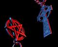
| 05/18/2004 04:36:11 PM |
The Exorcistby labudsComment by 16point2mm: Both the iconography and the angles of this shot capture my attention right from the start. Conceptually, this is among the best shots I've seen in this contest (opposites). I think the statement may have been more strongly served by baffling your lights such that no red fell on the cross, and no blue fell on the pentagram. The edging on the pentagram is faint enough to ignore, but the red edge on the cross is so noticeable as to confuse the sense of color involved in your statement. |
Home -
Challenges -
Community -
League -
Photos -
Cameras -
Lenses -
Learn -
Help -
Terms of Use -
Privacy -
Top ^
DPChallenge, and website content and design, Copyright © 2001-2026 Challenging Technologies, LLC.
All digital photo copyrights belong to the photographers and may not be used without permission.
Current Server Time: 07/22/2026 03:38:23 AM EDT.