Mother of Threeby
labudsComment by Lustre: Greetings from the Critique Club
Technical elements
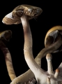
The image is crisp and nicely saturated in colour. In general I really like the lighting - the darker background mushrooms are perfect, the lighting on the head of the main mushroom is great - my only negative is the overlit stalk of the main mushroom. Towards the base is becomes overexposed and loses its texture.
Composition
I like the composition - have a couple of background mushrooms disappearing out of frame works fine. The "three" baby mushroom are tucked a bit too far into the corner for my liking, particularly the one disappearing out of the bottom of frame since it's a key element of the image. The black background isolates the subject, but works well with the creative lighting chosen.
Border / Title
You haven't used any border - which is a fine decision for this image. With the black background there is no need for an additional border.
At first I had the feeling that you had used the title to force the image into fitting the challenge, but when I think about it more the odds of finding three "baby" mushrooms attached to one large one are pretty slim.
Personal / Emotional qualities
The image doesn't evoke a lot of emotion in me - it's almost humourous in a way... Choosing a mushroom as the subject of the "Mother" challenge. It is a very nice artist style shot though, and I don't have any issue when they don't evoke emotion - they still look great!
Summary
Well done on this shot. I noticed it didn't score as well as some of your other shots, and it's perhaps not quite as good as your DiscoMushroom11 shot, but it's still quite nice on it's own.