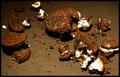
That's the Way the Cookie Crumblesby
DiamondPeteComment by LucidLotus: Hello from the Critique Club!
Splendid image! Fits the challenge perfectly and works well on its own. I especially enjoy the contrasts and the textures shown. There are a few areas that I think could use some work though, so let's get cracking:
First lighting: I like the lighting here, I think the position is good, however something to either diffuse the light or alternative positioning may have helped combat the overexposure of the creamy goodness, while still allowing for the nice spotlight-ish effect currently in the photo.
Composition is great. I really like how the cookie crumbling turned out, the random placement of the cookie pieces gives it a very natural look, avoiding the stiff blockiness that a setup shot might have. Granted, if you did arrange the pieces specifically, extra kudos to you - you got it to look perfectly natural.
The contrasts are what really bring my eye in and keep me interested. The obvious being the dark color of the cookie and background against the light of the cookie creme. This type of image always has a nice punch to it, and this one is no exception. I think the lighter black tone of the background gives another contrast element and adds to the image.
A more subtle contrast that I am really enjoying is that of the textures shown with the two main ingredients: The brittle, gravel-like texture of the cookie vs the soft, smooth, creamy nature of the filling. Both are evident in the photo - though with the overexposure of the filling some of that is lost - were it toned down a bit I think that would show to greater effect.
Finally, my main issue with the photo aside from the blown out white, is the focus. Other commenters have mentioned it as well, and I have to agree. With an image like this, having such contrasts and textures available, a nice crisp focus would really make the photo pop and give it a bit more depth. I think this aspect is even more crucial than the overexposure because it blankets the whole image, whereas the whites are only a part of the image - though a noticeable one.
Very nice idea, well executed though some improvements could be made. Well done.