| Image |
Comment |
| 02/23/2004 04:41:06 PM |
|
| 02/22/2004 01:57:35 AM |
|
| 02/21/2004 10:01:08 PM |
Black Hatby C_Steve_GComment by Rasai: I have looked at this particular photo on 6 different monitors and the difference is dramatic, from quite nice to - not quite so nice. The comment below from Beryl may help you feel more confident about your future submissions as you have no control on the gamma settings any other viewers/voters are using. Message edited by author 2004-02-22 08:21:34. |
| 02/21/2004 09:49:00 PM |
Black Hatby C_Steve_GComment by Beryl: Big Steve, Rusty made the comment below while I was logged in & was worried about what you would think. I told her 'no problem' & that you would probably have guessed as much because all of the spelin' was correct(DUH). Gamma calibration is critical for sure, it's dependant on the the viewers setting which you have no control of and your setting when you prep the photo for submission. Consider doing a screen capture of the calibration bar located in most of the viewing screens on the site. Calibrate you monitor for 'submissions', if it is diferent from your viewing preferance. Message edited by author 2004-02-21 21:50:19. |
| 02/21/2004 10:34:09 AM |
Black Hatby C_Steve_GComment by Rasai: Didn't get a chance to vote on all of them. Nucks! I am not knowledgeable enough re. photography to make a critique of Black Hat - except that I like it. Boogity, Boogity, Boogity with your next entry. |
| 02/21/2004 07:47:12 AM |
Black Hatby C_Steve_GComment by RedHotKK: Steve...sorry I missed voting in this challenge. I would have given this shot a 7 because it fit the challenge very well, was well composed, and I think the lighting was also very good. Message edited by author 2004-02-21 07:47:48. |
| 02/21/2004 06:10:43 AM |
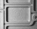
Scrap Metalby C_Steve_GComment by Mousie: I like simple abstract images, but I like them really obsessive... the ridge on the left is closer to the edge of the picture than the one on the right. Also, the circular hole just kisses the edge, which feels awkward to me... if you cropped off just a touch of the right side it would address both of those issues and polish the composition, I think. |
 Photographer found comment helpful. Photographer found comment helpful. |
| 02/21/2004 04:54:45 AM |
|
| 02/20/2004 09:10:22 PM |
Black Hatby C_Steve_GComment by AFViper: A little more light on the bottom and rear of the helmet might be better. you should've also moved the helmet a little farther from the background, I can see the black background on the top of the frame. This is a good idea, having the helmet coming out of the darkness, but it could be better. |
| Photographer found comment helpful. |
| 02/20/2004 03:39:08 PM |
Black Hatby C_Steve_GComment by pcody: The light on top and outlining the faceplate adds a nice touch to the photo altough I would have liked more light all the way around the faceplate. It looks like the texture of leather in the background, but my monitor isn't able to bring it out very well. If it is, I compliment you on the perfect choice of background. I had scored this 4 but because of your background, I'll bump up your score. If you edit on a mac, you might want to increase your gamma setting. If you don't, I apologize. |
| Photographer found comment helpful. |
Home -
Challenges -
Community -
League -
Photos -
Cameras -
Lenses -
Learn -
Help -
Terms of Use -
Privacy -
Top ^
DPChallenge, and website content and design, Copyright © 2001-2026 Challenging Technologies, LLC.
All digital photo copyrights belong to the photographers and may not be used without permission.
Current Server Time: 06/21/2026 07:13:09 AM EDT.