| Image |
Comment |
| 12/30/2015 06:11:46 PM |
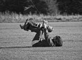
How Many?by PangurbanComment by snaffles: Greetings from the Critique Club!
Good composition, great textures and lighting, though a little surprised that you used the settings you did; a faster shutter/lower ISO/larger aperture is more the way I think most would go. Still, it did the job, and in the end that is all that counts.
I don't quite get the title, though; I'm not familiar with the brand so not sure if Barbour is known for having several layers and/or multiple zippers or teeth.
Hope this helps,
Susan |
 Photographer found comment helpful. Photographer found comment helpful. |
| 12/27/2015 05:45:19 PM |
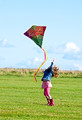
Kite Capersby PangurbanComment by snaffles: Greetings from the Critique Club!
Woohoo! Ellie, so glad to see you in the top ten with this image and even happier that some of my advice helped! You caught a very sweet and joyous moment here with mum and little boy both having a great time flying a kite. The kitestring leads us right to the heart of the action without distracting, and they're both having a great time and not noticing you at all. Simple and uncomplicated background, we see enough to get a sense of place and the ambient lighting shows us it's a nice sunny day.
Very, very glad and honoured that you set your inhibitions aside and took a chance. See how being sneaky can pay off? :-) Keep up the great work!
Susan |
| Photographer found comment helpful. |
| 11/24/2015 06:07:37 AM |
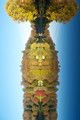
Kaleidoscopeby PangurbanComment by sidpixel: Hello from the Critique club
An interesting image that meets the challenge
Well, I have to commend you for attempting to inject some originality into the presentation of your entry but I'm sorry, it doesn't work for me. Also attention to the small details is always crucial, your rotation is not level it is leaning to the right and symmetry is important here, your crop is not equal left to right. Having said all that I do acknowledge and welcome your creative vision in looking and seeing beyond the norm that you have before you. You ask if the inclusion of wildlife would have enhanced it, in my opinion, yes it would if it were a normal presentation but in this form, no, I think it would have been a distraction. For this image to work at its best you need a very strict symmetry throughout.
Well done for your originality |
| Photographer found comment helpful. |
| 11/22/2015 03:54:06 PM |
|
| Photographer found comment helpful. |
| 11/18/2015 11:59:33 AM |
|
| Photographer found comment helpful. |
| 11/17/2015 09:02:07 PM |
|
| Photographer found comment helpful. |
| 11/16/2015 02:08:26 PM |
|
| Photographer found comment helpful. |
| 11/10/2015 07:47:52 PM |
A Throw Away Lineby PangurbanComment by Ecce_Signum: Greetings from Andi at the Critique Club (only a year late).
I like this image, it's vibrant, has good movement and well composed, especially so as it was originally shot for a Candid. Challenge. As  bvy bvy said the lines work really well here. I'm happy with the composition although the big issue is that you didn't straighten the horizon.
In an ideal world the girls right hand would be the one pointing upward and her right out - that would show her face and add another dynamic to the image.
I did say I like the composition but feel if you had a lower vantage point it would enhance the shot and separate her head from the horizon. The dof, sharpness and light is spot on for me.
It's a fun image and makes me smile (and, I should get the OH a pair of those wellies).
|
| Photographer found comment helpful. |
| 11/10/2015 08:49:16 AM |
|
| Photographer found comment helpful. |
| 11/09/2015 07:51:57 AM |
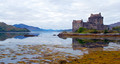
Eilean Donnainby PangurbanComment by snaffles: Greetings from the Critique Club!
Isn't this castle from either The Holy Grail or Princess Bride? Or both possibly; I've always enjoyed touring castles whenever I'm overseas. Anyway nice shot but I think it could use some work. I don't know if that great mat of yellowed vegetation in the bottom right does much for the comp; it's just there and partly swallowing the castle's reflection, and draws the eye away from the castle. I would love to have seen more of the ramp leading up to the castle from the right, but maybe there's just a huge carpark full of tour buses there :-) The light's a little dull but that's Britain for you. I think more contrast would have helped to add some drama.
Hope this has been helpful
Susan |
| Photographer found comment helpful. |
Home -
Challenges -
Community -
League -
Photos -
Cameras -
Lenses -
Learn -
Help -
Terms of Use -
Privacy -
Top ^
DPChallenge, and website content and design, Copyright © 2001-2026 Challenging Technologies, LLC.
All digital photo copyrights belong to the photographers and may not be used without permission.
Current Server Time: 06/12/2026 06:19:22 PM EDT.