| Image |
Comment |
| 10/12/2005 10:51:15 AM |
|
 Photographer found comment helpful. Photographer found comment helpful. |
| 10/12/2005 10:35:12 AM |
|
| Photographer found comment helpful. |
| 10/12/2005 09:41:25 AM |
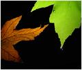
Grievingby jpochardComment by Jutilda: Love the sentiment. The green one seems slightly out of focus, as does the drop. The negative space is well used and I like the dead and living leaf. Clever take, but I wish it was tack sharp. 7 |
| Photographer found comment helpful. |
| 10/12/2005 07:15:45 AM |
Grievingby jpochardComment by Longreach: Wow, a really creative interpretation of the challenge. Beautiful, well taken. Great light. I'm thankful that someone could get past the obvious. |
| Photographer found comment helpful. |
| 10/12/2005 01:21:13 AM |
Grievingby jpochardComment by AP: very nice, very clever idea, and in a weird way it almost makes me sad... hah, 9 |
| Photographer found comment helpful. |
| 10/09/2005 12:36:08 AM |
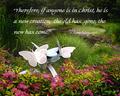
New Life in Christby jpochardComment by jpochard: Originally posted by SJCarter:
Wonderful choice of shots for the scripture selection. However, I think that your choice of fonts may be a little large and cumbersome for the subject matter in this particular case (just my humble opinion!). I think that if you were to select a slightly smaller and more delicate font for the text, the message might come across more favorably. Again, this is just my two cents. |
You know, I thought about that and tried it. However there is so much going on in the photo that smaller fonts really get lost. Maybe a different style would work better, Keeping the size. Thanks for taking the time to comment Jimmy. |
| 10/09/2005 12:27:39 AM |
New Life in Christby jpochardComment by SJCarter: Wonderful choice of shots for the scripture selection. However, I think that your choice of fonts may be a little large and cumbersome for the subject matter in this particular case (just my humble opinion!). I think that if you were to select a slightly smaller and more delicate font for the text, the message might come across more favorably. Again, this is just my two cents. |
| Photographer found comment helpful. |
| 10/09/2005 12:14:42 AM |
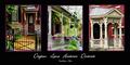
Historic Homes Trioby jpochardComment by SJCarter: Very nice triptych of the style of homes in the area. I like your choice of crops and subjects too - very conducive to the medium. Great showcase of color, detail, and textures for this particular presentation. Great job. My only minor suggestion would be that the middle shot could use a touch more contrast, as it loses a little detail in the lighter areas. |
| Photographer found comment helpful. |
| 10/09/2005 12:10:15 AM |
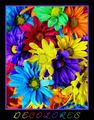
Decoloresby jpochardComment by SJCarter: I don't know how I overlooked this shot in your Portfolio before... It is by far one of my favorites! What wonderful playful colors and fun composition! Great job on editing/processing here! LOVE IT! Nice to see you let your hair down (so to speak). :-) Great stuff! |
| Photographer found comment helpful. |
| 10/06/2005 03:47:58 AM |
Balloon Overhead (1.25 ratio)by jpochardComment by shadow: note the artifacts on the upper left corner of the photo (above the baloon). there are also more on the baloon itself, on the lower- right areas. can you see them? can they be removed? Message edited by author 2005-10-06 03:48:37. |
| Photographer found comment helpful. |
Home -
Challenges -
Community -
League -
Photos -
Cameras -
Lenses -
Learn -
Help -
Terms of Use -
Privacy -
Top ^
DPChallenge, and website content and design, Copyright © 2001-2026 Challenging Technologies, LLC.
All digital photo copyrights belong to the photographers and may not be used without permission.
Current Server Time: 07/22/2026 08:05:11 AM EDT.