DPChallenge: A Digital Photography Contest You are not logged in. (log in or register
 
Browse Settings
Currently viewing:
Registered Usermarabu61

Show comments:

Per page:

Order:

Comments:


Comments Received by marabu61
Pages:  
Showing 51 - 59 of ~59
Image Comment
dead end
06/07/2012 12:59:51 AM
dead end
by marabu61

Comment by DrAchoo:
Never have your title be the name of the challenge. ;)
dead end
06/06/2012 11:31:41 PM
dead end
by marabu61

Comment by neenee1999:
Nice image, great DOF
the weeping rose
06/06/2012 01:50:44 PM
the weeping rose
by marabu61

Comment by emilyadventures:
Great placement of water droplets to emphasis the depth and shallow focus.
the weeping rose
06/06/2012 08:34:35 AM
the weeping rose
by marabu61

Comment by blindjustice:
thoughtful.
the bug and the poppy
05/30/2012 02:11:58 AM
the bug and the poppy
by marabu61

Comment by Ammie:
Great colour combination here but the "green" focus is too soft. Maybe it's just not close enough. 5
Nostalgic Coca Cola
04/30/2012 12:34:56 PM
Nostalgic Coca Cola
by marabu61

Comment by snaffles:
Greetings from the Critique Club!

Hello Daniel, I'm Susan and I'll be your CC member today :-) I know how tough chefs have to be (I work in a fine-dining restaurant) so I know you can take criticism.

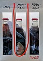
Interesting take on the challenge. I think you may have tried to do a little too much here; the plastic in or around the Coke bottles isn't really necessary. The Coke bottles are different shapes and each already has its own frame, so wondering why the red drawstring/handle draping down? It could be to draw attention to the middle bottle which looks to be the most interesting, as you can read the label and see the design. But as it stands, it's ambiguous and a little on the messy side.

It's not unlike plating a dish, you want just the right amount of side and veggies to enhance and complement the entree, not compete with it. Think of your subject as the entree, then your comp and lighting as the side and veg, and the background is your plate. And as with most creative endeavours, less is definitely more.

Here's a trick I recommend to help you see for yourself what works. Choose a challenge, then go through all the entries...but start at the very last page, and work your way up to the ribbon winners. As you do this you will notice the comp and lighting improving and getting tighter, and depending on the challenge, the level of editing getting more skillful.

Hope this critique has been of help, and do feel free to PM me with any questions or comments.

bye for now and welcome to the madhouse! :-)

Susan
Photographer found comment helpful.
Nostalgic Coca Cola
04/21/2012 09:37:48 AM
Nostalgic Coca Cola
by marabu61

Comment by kasaba:
This is great - hope they pay you for it :-). I find the stuff in the background (plastic bag of some type?) distracting. I am also not sure if the celophane reflection in or on the bottles adds to the picture. I do love the idea though. Are they really that old?
Photographer found comment helpful.
Nostalgic Coca Cola
04/20/2012 04:01:26 PM
Nostalgic Coca Cola
by marabu61

Comment by lola72:
i would have voted this higher , except I don't like the thing behind the bottles,distracting ..
Photographer found comment helpful.
Nostalgic Coca Cola
04/18/2012 12:15:18 AM
Nostalgic Coca Cola
by marabu61

Comment by Lydia:
Wonderful for Basic editing if it's legal! Well done!


(commenting only)
Photographer found comment helpful.
Pages:  
Showing 51 - 59 of ~59


Home - Challenges - Community - League - Photos - Cameras - Lenses - Learn - Help - Terms of Use - Privacy - Top ^
DPChallenge, and website content and design, Copyright © 2001-2025 Challenging Technologies, LLC.
All digital photo copyrights belong to the photographers and may not be used without permission.
Current Server Time: 06/16/2025 10:02:31 AM EDT.