| Image |
Comment |
| 10/02/2007 02:56:35 PM |
|
 Photographer found comment helpful. Photographer found comment helpful. |
| 10/02/2007 02:42:34 PM |
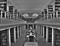
LMH libraryby kirsty_mcnComment by ltlmschrisss: Awesome processing. I really like that it looks really cool but it doesn't look over processed. Tones are awesome as well as the perspective. |
| Photographer found comment helpful. |
| 10/02/2007 02:29:43 PM |
LMH libraryby kirsty_mcnComment by Ken: If they ever have a symmetry challenge, something like this would score really well. I like the symmetry of course, and the leading lines and columns are simply awesome.
It takes a bit of practice to get good at HDR & Photomatix and you're off to a good start. How many different exposures did you use? |
| Photographer found comment helpful. |
| 10/02/2007 02:28:51 PM |
|
| Photographer found comment helpful. |
| 10/02/2007 02:05:41 PM |
|
| Photographer found comment helpful. |
| 10/02/2007 01:31:41 PM |
|
| Photographer found comment helpful. |
| 06/25/2006 07:19:46 PM |
Tombstonesby kirsty_mcnComment by Ecce_Signum: comment from my 1-4-0 thread...
Great composition here with the young family walking out of a dark area into the light and away from the cemetery. I agree with rex about those 2 leaves and wonder if the focus would work better at the front of the shot with a little dodging/burning on the front tombestone? |
| Photographer found comment helpful. |
| 06/25/2006 07:10:29 PM |
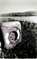
Lifesaving ringby kirsty_mcnComment by kirsty_mcn: Originally posted by Louis:
The bottom of the photo has some kind of unsettling border. I don't know why it's there, but it probably should have been cropped out, because it detracts from this wonderful picture. I also see something along the right edge, and also less so along the left edge. |
Thats a random border from printing in the darkroom, some of the enlargers gave that kinda rough border which sometimes worked well but I agree needs to be cropped out here |
| 06/01/2006 06:26:52 AM |
a8_web.jpgby kirsty_mcnComment by LalliSig: This one looked great as a thumbnail but I was dissapointed when I opened it, would have been tons better if the focus had been on all the flower, or at least on the portion that is up front. This has some real potential and berhaps I am being to harsh, I am admittedly comparing this to DrAchoos free study XI entry wich was similar. Keep it up :) |
| Photographer found comment helpful. |
| 06/01/2006 06:23:32 AM |
a9_web.jpgby kirsty_mcnComment by LalliSig: This is my favorite of this bunch. I like it, the colors work well together, the backround and flower too. I like the stalk thing or whatever it is that is in front of the flower but not the top one that just barely is in the frame at top, think it´s too much and should be removed. Nice job technically and with the lighting. |
| Photographer found comment helpful. |
Home -
Challenges -
Community -
League -
Photos -
Cameras -
Lenses -
Learn -
Help -
Terms of Use -
Privacy -
Top ^
DPChallenge, and website content and design, Copyright © 2001-2026 Challenging Technologies, LLC.
All digital photo copyrights belong to the photographers and may not be used without permission.
Current Server Time: 07/17/2026 03:10:11 AM EDT.