| Image |
Comment |
| 05/10/2002 12:30:00 AM |
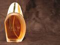
Realmby shortredneckComment by irae: "Ream Womin"? The composition is okay, except that the bottle really ought to face into the frame instead of out. Lighting could be much better - the cap is just a mess of reflections and hotspots. This kind of thing - chrome and glass - is very hard to do, but I think you could do better than this even without studio gear. Try some white foam core to take control of the light and reflections next time. Also seems oversharpened. |
| 05/09/2002 10:04:00 PM |
|
| 05/09/2002 03:36:00 PM |
Realmby shortredneckComment by karmat: One of my favorites. Very crisp, well lit, good color choice for the backdrop, I like the empty space on the right. VERY WELL DONE!! (Does it smell good?) |
| 05/09/2002 03:22:00 PM |
Realmby shortredneckComment by anleba: I don't like this at all but it fits with most perfume ads. Perfume and nothing else. Overused. |
| 05/08/2002 10:30:00 PM |
Realmby shortredneckComment by Amphian: I like the light coming through the bottle and the fact that you left room for ad text, but I think that the text on the bottle is too hard to read and the photo is a little noisy. |
| 05/08/2002 07:34:00 PM |
|
| 05/08/2002 05:59:00 PM |
|
| 05/08/2002 03:39:00 PM |
|
| 05/08/2002 07:44:00 AM |
Realmby shortredneckComment by magnetic9999: very cool. great composition, framing. simplicity at it's best. i wonder why the letters are gone? eiuther your lighting wasnt set up to really bring the letters out. or you lost them to compression artifacts. that would be a number one priority though: having a clear name. still, a great shot. |
| 05/07/2002 11:36:00 PM |
Realmby shortredneckComment by Gordon: great use of negative space for 'copy' room. Top is a bit overexposed, but hard to light well. |
Home -
Challenges -
Community -
League -
Photos -
Cameras -
Lenses -
Learn -
Help -
Terms of Use -
Privacy -
Top ^
DPChallenge, and website content and design, Copyright © 2001-2026 Challenging Technologies, LLC.
All digital photo copyrights belong to the photographers and may not be used without permission.
Current Server Time: 05/31/2026 11:55:55 PM EDT.