| Image |
Comment |
| 09/13/2002 01:30:00 PM |
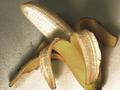
The Stripperby shortredneckComment by karmat: Funny title! It looks like you have used a lot of contrast (?) on this, which i think gives it an edgy feel. That is effective, I think. The colors are a little bland to me though. Maybe a different background color to give it some contrast. karmat |
| 09/11/2002 11:57:00 PM |
|
| 09/10/2002 11:56:00 PM |
|
| 09/10/2002 07:19:00 PM |
The Stripperby shortredneckComment by myqyl: At first I scored this low. The contrast and lighting seemed harsh. They are still harsh, but it's growing on me. |
| 09/09/2002 03:09:00 PM |
The Stripperby shortredneckComment by FranziskaLang: you've got some funky lighting going on here, or you've played with the contrast too much. i think a more plain background would have worked better for me, and either cropping off more than just the end of the banana or having everything in the frame. this way, it looks accidental to me. -- gr8photos. |
| 09/09/2002 11:06:00 AM |
|
| 09/09/2002 12:58:00 AM |
|
| 09/06/2002 05:43:00 PM |
Naptimeby shortredneckComment by johnmk: Without motto I would have been unable to interpret this picture. A different point of view might have made interpretation easier. |
| 09/04/2002 11:03:00 AM |
Naptimeby shortredneckComment by jmsetzler: This is a good candid and it meets the challenge. Your subject is not particularly 'inspiring' overall... The 'wow' factor is just not here... This challenge required some deep thought for sure :) - jmsetzler |
| 09/03/2002 07:56:00 PM |
Naptimeby shortredneckComment by Indigodingo: While this may or may not be candid I think considering the subject was asleep you could have and should have chosen a more interesting angle. The focus seems to be more on the chair and not the boy. |
Home -
Challenges -
Community -
League -
Photos -
Cameras -
Lenses -
Learn -
Help -
Terms of Use -
Privacy -
Top ^
DPChallenge, and website content and design, Copyright © 2001-2026 Challenging Technologies, LLC.
All digital photo copyrights belong to the photographers and may not be used without permission.
Current Server Time: 05/30/2026 03:02:52 PM EDT.