| Image |
Comment |
| 02/11/2004 04:32:37 PM |
|
 Photographer found comment helpful. Photographer found comment helpful. |
| 02/11/2004 01:30:55 PM |
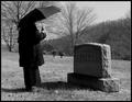
Mrs. Brownby lilnukeeComment by Claya: Nice composition and idea. Technically sound as well. Don't see much I'd change. |
| Photographer found comment helpful. |
| 02/11/2004 12:43:03 PM |
Mrs. Brownby lilnukeeComment by jpochard: The umbrella seems out of place since I can't tell it's raining. I would have liked some light and some detail on this side of the tombstone. I like the tones of the photo and the idea fits the challenge. |
| Photographer found comment helpful. |
| 02/11/2004 07:34:38 AM |
Mrs. Brownby lilnukeeComment by GoodEnd: Good shoot. Very emotive too. I really like 1 to 1.3 stops more to reveal clearly the grave´s name. May be you had used som kind of eveluative or weighted metering that makes this commom mistakes. Your dynamic range seems to allow you to do a 1 to 1.3 stops adjust without blow higlights. |
| Photographer found comment helpful. |
| 02/11/2004 06:30:11 AM |
|
| Photographer found comment helpful. |
| 02/11/2004 04:44:15 AM |
|
| Photographer found comment helpful. |
| 02/11/2004 12:21:24 AM |
Mrs. Brownby lilnukeeComment by flip89: Good shot. If probably be most improved if you showed just a little bit of the head, still covered but maybe a part of the face should show. |
| Photographer found comment helpful. |
| 01/27/2004 06:46:41 PM |
|
| Photographer found comment helpful. |
| 01/27/2004 11:49:06 AM |
|
| Photographer found comment helpful. |
| 01/24/2004 11:46:57 AM |
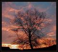
Tree in Silhouetteby lilnukeeComment by Konador: Critique Club
Wow, what great sunset colours. The colours along with the cloud formation really do look very nice. I like the centered composition and the tree looks great silhouetted. I think your main problem here is the jpeg compression. Your file is only 87kb, out of a 150k maximum. This means there are artifacts in the sky, and around the tree. I makes the pic look blurry and just generally not as appealing.
You say in your comments that you were experimenting with borders. I think the border looks okay but it could be better suited to the photo. At the moment you have 2 layers, with a line in the middle. I think you should only have 1 layer, so it looks thin, and put the thin white line in between the photo and the black border. This makes sure the black parts of the photo don't blend into the border.
I think some of the comments you got do bring up some good points. The colours could be even more eye-catching if you boosted the saturation a bit more in postprocessing. Also, a lot of people think 'after dark' means when the sun is completly gone. Voters are very literally minded here, so it's useful to take that into account.
Overall, this is a nice sunset photo, but slightly lacking in image quality. Play around with other compression levels to try and get something a little less artifacty. |
| Photographer found comment helpful. |
Home -
Challenges -
Community -
League -
Photos -
Cameras -
Lenses -
Learn -
Help -
Terms of Use -
Privacy -
Top ^
DPChallenge, and website content and design, Copyright © 2001-2026 Challenging Technologies, LLC.
All digital photo copyrights belong to the photographers and may not be used without permission.
Current Server Time: 07/16/2026 11:17:07 PM EDT.