| Image |
Comment |
| 06/23/2004 09:39:41 PM |
Tennessee Real Estateby lilnukeeComment by pitsaman: Building is the main subject here ,right?
Then you wait until Sun light the building side you take photo off not the grass.
Photo takung is all about capturing the light not a cute or ugly subjects.4 |
| 06/23/2004 07:44:00 PM |
|
| 06/23/2004 06:55:41 PM |
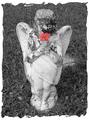
In Loving Memoryby lilnukeeComment by nborton: the centering of the statue and flower works well. one thing i would try to improve would be to increase the contrast in the b&w. the b&w part looks just a tad flat. i wouldn't change it much though. |
| 06/23/2004 04:40:43 PM |
|
| 06/23/2004 12:53:00 PM |
Tennessee Real Estateby lilnukeeComment by KaDi: This is a nice image. I like your treatment of the "For Sale" sign. I think you should crop to straighten the horizon line. There is also a lack of contrast in the foreground weeds which, under different editing rules, might be enhanced. |
| 06/23/2004 12:28:42 PM |
|
| 06/23/2004 05:21:52 AM |
|
| 06/23/2004 01:04:11 AM |
In Loving Memoryby lilnukeeComment by TooCool: Your color portion of this shot doesn't quite look right, kinda like it's pasted in. Don't know if it's because the colors are alittle dull or because the delineation is too sharp. Next time try feathering your selection to make the transition a touch more gradual...
TC |
| 06/22/2004 11:46:27 PM |
In Loving Memoryby lilnukeeComment by C-town driver: Nice composition and good work on the desaturation. I hate to say it, but I really can't stand the frame as it gives a sort of post-cardy feel to an otherwise somber photo. |
| 06/22/2004 12:06:27 PM |
In Loving Memoryby lilnukeeComment by Pidd: Something's not quite right. I love the idea and the composition of the shot, but the face on the angel is so dirty or deteriorated it really loses a lot. Also, the poppy...hm...not sure what's wrong there. Too bright maybe? It looks fake, even if it's not. It APPEARS as if it was creatively photoshopped in. Maybe if it was toned down, made to be a softer shade of red? |
Home -
Challenges -
Community -
League -
Photos -
Cameras -
Lenses -
Learn -
Help -
Terms of Use -
Privacy -
Top ^
DPChallenge, and website content and design, Copyright © 2001-2026 Challenging Technologies, LLC.
All digital photo copyrights belong to the photographers and may not be used without permission.
Current Server Time: 07/17/2026 06:51:16 PM EDT.