| Image |
Comment |
| 05/03/2004 04:17:32 AM |
The Hollowsby MJENNIComment by L1: Very moody. A tad dark for my personal taste, but it does fit the challenge nicely. |
 Photographer found comment helpful. Photographer found comment helpful. |
| 05/03/2004 12:41:05 AM |
|
| Photographer found comment helpful. |
| 05/01/2004 06:36:19 PM |
|
| Photographer found comment helpful. |
| 05/01/2004 04:07:16 PM |
Down By the Stationby MJENNIComment by Tranquil: Sure to rate high in this challenge.
My only criticisms are the noise, the power lines, and the focus.
The noise could have been dealt with and it is not terrible but it is evident.
The powerlines could have been easily cloned out and that sort of riuned the mood of this olde tyme shot to me.
Lastly, the focus seems a bit off, and is not perfect on your center of interest, the "Mocksville" Sign |
| Photographer found comment helpful. |
| 05/01/2004 09:43:15 AM |
Down By the Stationby MJENNIComment by qmdi: I really enjoy this picture. In my opinion it is lacking contrast overall "except the sign and building" maybe this is the look you were trying to achieve. Good luck! |
| Photographer found comment helpful. |
| 05/01/2004 05:27:45 AM |
Down By the Stationby MJENNIComment by dhare: This shot has a weird surreal feel about it. The sign looks bizarre, as does the lighting behind the building. Not sure what was done here, or if I even like it.. hehe.. 7 |
| Photographer found comment helpful. |
| 04/30/2004 05:59:34 PM |
Down By the Stationby MJENNIComment by lecalan: Nicely done. Love the composition and choice of black and white. Would have liked more contrast so the train tracks and trees stand out more.The grainy look makes it seem like an old time photo, but I can't decide if I like the grain or not. Overall: 8 |
| Photographer found comment helpful. |
| 04/30/2004 02:55:40 PM |
|
| 04/30/2004 12:21:46 AM |
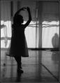
School of Danceby MJENNIComment by leaf: nice shot. I really like the cropping in this image. i think the contrast could use a little bumping though. it seems a bit low, I can't find any real white in the image.. just a dull grey. I don't know if it was purposful (i guess i should assume it is) but i think i like the shadow of the ballerina leg in the background,.. it provides a nice contrast to the young girl. nice pose, and i like the profile of the face. It gives the image a little more feeling... i think the shadows on the back wall work well as well (excpet for those two strong lines going horizontal).
good job.
-from the critique club. |
| 04/29/2004 08:50:56 PM |
|
| Photographer found comment helpful. |
Home -
Challenges -
Community -
League -
Photos -
Cameras -
Lenses -
Learn -
Help -
Terms of Use -
Privacy -
Top ^
DPChallenge, and website content and design, Copyright © 2001-2026 Challenging Technologies, LLC.
All digital photo copyrights belong to the photographers and may not be used without permission.
Current Server Time: 07/15/2026 11:34:50 PM EDT.