Road Signs Never Lieby
wwjdwithcaComment by wwjdwithca: Thanks for your comment, and your reactions are understandable from the way that you perceived it. I also appreciate you taking the time to understand the photo, even though you didn't understand the story as I was trying to tell it. That happens. I believe good photography should be subtle in it's story, and allow mutliple interpretations.
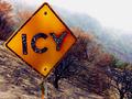
I loved not only the contradiction of the area around the sign (the black paint is actually flaking away from the heat) and the sign showing it had been ravaged from fire, then the outer edges of the frame showing no sign of fire at all, then of course the fog.
The propaganda portion of the photo is obviously just poking fun of the D.O.T. I personally was proud of the depth of the photo. Not only the tonality of the colors, but the story it told as well. The paradox from the burned regions to the untouched areas. How fire (and life itself as a metaphor) can be so indescrete, so arbitrary. Than the outer areas lined with fog showing the "mourning of the aftermath".
Now, there is no way I expected everyone to understand the story as I saw it. To me, that's what art is all about, that each person can absorb the story from a different perspective.
My problem, is all of the exremely low scores (three's or less). Empirically the photo deserves much better than that, and from my perspective these scores were given by people who thought it didn't meet the challenge requirements, so they significantly down-graded the image. It's unfortunate, because I feel like it's some of the best work I have ever done, and to get downgraded over politics is dissapointing.
It doesn't change how I feel about the photograph. I'm still proud to have it in my portfolio.