| Image |
Comment |
| 11/19/2003 10:51:11 AM |
|
 Photographer found comment helpful. Photographer found comment helpful. |
| 11/19/2003 09:00:11 AM |
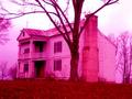
Our Children's Heroes?by jpb323redComment by crabappl3: Interesting concept. The image seems oversaturated, and is too small. When saving for the web, save the image at 72 dpi and 640 pixel on the longest side. This will give your viewer a larger image so that they can make out the details in your shot. 4 -danny |
| Photographer found comment helpful. |
| 11/17/2003 01:59:53 PM |
|
| Photographer found comment helpful. |
| 11/16/2003 07:11:10 AM |
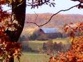
the simple red barnby jpb323redComment by KevinRiggs: The focus on this image seems to be soft throughout. Perhaps touching it up with USM would have helped some. The single, bare branch just above the barn distracted from the peaceful blend of FG to BG that was brought about by the rust colored leaves and dark tree trunk giving way to the muted colors of both the barn and the ridgeline/mills in the BG. |
| Photographer found comment helpful. |
| 11/15/2003 07:53:58 PM |
the simple red barnby jpb323redComment by Neuferland: This is a good idea and the framing is well done with the leaves and tree but the size and lack of clarity in any part of the shot really hurts this. DOF doesn't work i in this becaus no one part of the shot is in focus. The coloring is close to perfect and the cropping is very well done. A 5 |
| Photographer found comment helpful. |
| 11/14/2003 09:02:35 PM |
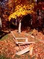
Bygonesby jpb323redComment by blindjustice: Nice and relaxing- the composition is better thanthe technicality!- and that is much better than the other way around. |
| Photographer found comment helpful. |
| 11/14/2003 02:15:57 AM |
Bygonesby jpb323redComment by joannadiva: would have perfered this at a differnt angle or with the chair placed diffrently. also the feel here is a reminise and sepia usualy indecates past rememberances.
Good light, exposure and focus Comosition and arangement needs work |
| Photographer found comment helpful. |
| 11/13/2003 11:31:26 PM |
|
| Photographer found comment helpful. |
| 11/13/2003 08:26:35 PM |
|
| Photographer found comment helpful. |
| 11/13/2003 07:22:20 PM |
Bygonesby jpb323redComment by sonnyh: This picture is very washed out in color. You might have tried to take it at a different time of day. Also I don't think the composition is as good as it could be. Maybe moving the chair more at an angle would have made it look a little better. From the shadows I can see that you had a small area to work in, but I think a different arrangement would have worked better. |
| Photographer found comment helpful. |
Home -
Challenges -
Community -
League -
Photos -
Cameras -
Lenses -
Learn -
Help -
Terms of Use -
Privacy -
Top ^
DPChallenge, and website content and design, Copyright © 2001-2026 Challenging Technologies, LLC.
All digital photo copyrights belong to the photographers and may not be used without permission.
Current Server Time: 07/17/2026 10:48:43 PM EDT.