| Image |
Comment |
| 08/31/2005 01:55:51 PM |
|
 Photographer found comment helpful. Photographer found comment helpful. |
| 08/31/2005 10:26:42 AM |
|
| Photographer found comment helpful. |
| 08/31/2005 08:29:35 AM |
|
| Photographer found comment helpful. |
| 08/31/2005 12:48:30 AM |
|
| Photographer found comment helpful. |
| 08/30/2005 11:20:59 PM |
|
| Photographer found comment helpful. |
| 08/30/2005 08:40:36 PM |
|
| Photographer found comment helpful. |
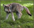
| 08/30/2005 05:45:27 PM |
Startledby cheekymunkyComment by SJCarter: First, I think this is a great pose and a very striking image. Second, there are several things that stand out to me as areas that could possibly be improved. One, the clean crisp edges of the canine almost seem surreal - they could probably be blended a bit (with a blending brush of about 2-3 pixels width) to make the image flow more smoothly - this of course from someone who just got NAILED for their processing of an image. Two, the eyes seem surreal - almost painted on. I think that the processing there could be toned down a touch. Three, the focus of the animal versus the focus of the grass seem to conflict around the animal's placement. It could just be me (it wouldn't be the first time!), but it seems like these two aspects have been processed separately and with different perspectives in mind. IMHO, (and I have an AWFUL time with this, trust me) getting all of the elements of a single shot to coalesce into a cohesive unit is not an easy task. Especially when dealing with the pressures of a site like this with comments like "the color needs a bump", "you've over sharpened", "needs more contrast", "dodge & burn more", etc.). Four, I think that the canine would benefit from some of these "frequently recommended" techniques. I think you could really make this image pop a lot more, BUT it is a strong statement on its own (currently). You decide whether or not to implement any of my (or anyone else's) suggestions.
PS: Sorry for rambling... |
| Photographer found comment helpful. |
| 08/30/2005 05:28:37 PM |
Bluebells at Clyne IIby cheekymunkyComment by SJCarter: Wow - what a picturesque scene. I think that you could really make it pop with some more contrast, color sat, and a bit of burning. This is truly a remarkable shot - the composition, subject matter, interest is all there - it just needs a little boost IMHO. |
| Photographer found comment helpful. |
| 08/30/2005 04:37:50 PM |
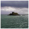
The Mumbles Lighthouse Iby cheekymunkyComment by SJCarter: I know this sounds cliche (especially given some of the recent forum threads), but I really think this would look great with a lot of burning to increase the depth and breadth of colors/contrast. I think it would increase the visible detail and overall "gloomy & desolate" feel that the shot seem to want to convey. I don't want you to think that I'm all about everyone making all of their shots look more like Heida's or Joey Lawrence's, but in this particular instance, I think a bit of those "stylized" aspects could really enhance this image. Don't get me wrong - it's a beautiful shot as is. |
| Photographer found comment helpful. |
| 08/30/2005 04:32:50 PM |
|
| Photographer found comment helpful. |
Home -
Challenges -
Community -
League -
Photos -
Cameras -
Lenses -
Learn -
Help -
Terms of Use -
Privacy -
Top ^
DPChallenge, and website content and design, Copyright © 2001-2026 Challenging Technologies, LLC.
All digital photo copyrights belong to the photographers and may not be used without permission.
Current Server Time: 07/20/2026 02:56:13 AM EDT.