| Image |
Comment |
| 08/20/2004 09:46:03 AM |
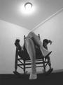
On A Summer Nightby muur88Comment by pcody: Read the comments. The bare walls. That's another thing that adds to the mood I felt. Keep up the good work. |
 Photographer found comment helpful. Photographer found comment helpful. |
| 08/19/2004 11:49:59 PM |
Even Flowby muur88Comment by dustin03: i like to see more detail of the background pedals...perhaps to much DOF.... |
| Photographer found comment helpful. |
| 08/17/2004 11:23:43 PM |
|
| Photographer found comment helpful. |
| 08/17/2004 02:29:48 PM |
|
| Photographer found comment helpful. |
| 08/16/2004 10:54:23 AM |
Even Flowby muur88Comment by cooliak: very neat .. but I think it would have been nicer to have the rest of the flower in focus .. but like me you are probably limited by your equipment (7) |
| Photographer found comment helpful. |
| 08/15/2004 11:28:45 PM |
On A Summer Nightby muur88Comment by Olyuzi: Beautiful legs! but pic could use some more contrast. Better not to shoot straight into the light source. I like the wide angle distortion to emphasize the legs and feet. |
| Photographer found comment helpful. |
| 08/14/2004 02:20:49 PM |
On A Summer Nightby muur88Comment by pitsaman: B/w lack of tonality and contrast. Very well perspective.Focus little soft,smaller aperture would help better.6 |
| Photographer found comment helpful. |
| 08/14/2004 12:24:35 PM |
On A Summer Nightby muur88Comment by graphicfunk: Very good angle and great simplicity of background makes this b/w a wholesome entry to this challenge. It has that lazy feel. Bumping from 5 to 7 Message edited by author 2004-08-16 01:43:47. |
| Photographer found comment helpful. |
| 08/13/2004 03:11:56 PM |
|
| Photographer found comment helpful. |
| 08/13/2004 07:20:07 AM |
On A Summer Nightby muur88Comment by dsa157: I really like the point of view here although I wish there was slightly more space between the upper knee and where the ceiling moulding comes to a corner. The pose and the lighting are also very nice. the tomes are too flat for my tastes though - I'd like to see more punch from darker black tones. The "horizon" line of the floor looks crooked to me, but that might have been intentional given the camera angle. |
| Photographer found comment helpful. |
Home -
Challenges -
Community -
League -
Photos -
Cameras -
Lenses -
Learn -
Help -
Terms of Use -
Privacy -
Top ^
DPChallenge, and website content and design, Copyright © 2001-2026 Challenging Technologies, LLC.
All digital photo copyrights belong to the photographers and may not be used without permission.
Current Server Time: 07/27/2026 12:19:18 PM EDT.