| Image |
Comment |
| 04/07/2003 08:14:33 AM |
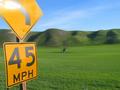
Forty Five Miles Per Hourby lennierComment by crabappl3: Loose the sign and I'd have given this a much higher score. The bright spot of the sign pulls the eye away from the nice green rolling hills. -danny |
 Photographer found comment helpful. Photographer found comment helpful. |
| 04/07/2003 06:08:11 AM |
|
| 04/07/2003 05:31:56 AM |
Forty Five Miles Per Hourby lennierComment by inspzil: Not really sure why this sign is in the picture to be perfectly honest. Looks like a fine shot without it. I would've just kept the little skinny tree as the focal point of the photo and captured that wonderful green carpet. By including the sign, you also include the wires at the bottom. |
| 04/07/2003 03:53:55 AM |
|
| Photographer found comment helpful. |
| 04/07/2003 02:44:07 AM |
Forty Five Miles Per Hourby lennierComment by mk: Nice, clear color in everything except for the bright glare in the upper left hand corner which is a bit distracting. Other than that, the picture hardly seems like it's real. Good shot. |
| 04/07/2003 01:06:49 AM |
|
| 04/02/2003 02:46:41 PM |
Silenceby lennierComment by timj351: Critique Club critique by Tim Jensen
Even though I feel that this is a decent photo I am a little uncomfortable with this photo for a couple of main reasons. The first reason is the pasty color of the skin that tends to convey less emotion rather than more. It is an interesting effect but I don't feel that it works well in this photo. The second reason is the cropping. It appears unecessarily tight. If the cropping were relaxed to show more of the crowd this man would still be the focal point but with the addition of the crowd around him it would help tell the story of the event and further add to the emotion.
I find a strong sense of emotion to be lacking here. Instead I find a very complacent scene. This is due to the fact that I can only see the man's eyes and only a slight expression on the woman behind him. It is a surprise to me to see a photo taken in a crowd where I see so few expressions. I understand your title of 'Silence' but I find that the man's eyes and stance just aren't conveying much emotion.
Technically it is well done with good values and sharp clean edges.
I believe I understand what you were trying to do in the way of isolating this young man and trying to convey his attituted toward the current events but I just feel that this particular style wasn't the best method of doing it.
T |
| 03/28/2003 08:13:13 PM |
Silenceby lennierComment by KarenB: the color cast is so strange here.. almost looks like someone came out of the past to voice their opinion with modern day participants. neat how it looks "then & now" |
| Photographer found comment helpful. |
| 03/27/2003 09:49:51 PM |
|
| 03/25/2003 09:50:48 AM |
|
| Photographer found comment helpful. |
Home -
Challenges -
Community -
League -
Photos -
Cameras -
Lenses -
Learn -
Help -
Terms of Use -
Privacy -
Top ^
DPChallenge, and website content and design, Copyright © 2001-2026 Challenging Technologies, LLC.
All digital photo copyrights belong to the photographers and may not be used without permission.
Current Server Time: 07/16/2026 06:09:59 AM EDT.