| Image |
Comment |
| 12/23/2005 12:57:45 PM |
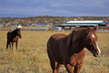
Horsesby MadMan2kComment by Jutilda: I like the sense of you standing there as they walk by. Nicely focused with interesting blur behind. |
 Photographer found comment helpful. Photographer found comment helpful. |
| 12/23/2005 12:57:01 PM |
Horsesby MadMan2kComment by SJCarter: Beautiful shot! Great focus & DOF. I love the natural color tones and landscape too. Good job. |
| Photographer found comment helpful. |
| 12/21/2005 01:44:37 PM |
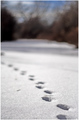
Footprintsby MadMan2kComment by Imagineer: Such a small creature too - nice observation. Love the exposure and off-screen mystery. Horizon looks tilted but without doubt a nice shot. Improvements I would imagine could be:
> focus slightly further away to give both fore- and background blurring
> straighten horizon
> focus even closer (losing some sky) to show scale more dramatically |
| Photographer found comment helpful. |
| 12/17/2005 11:11:52 PM |
|
| Photographer found comment helpful. |
| 12/17/2005 09:46:53 AM |
Doorby MadMan2kComment by downtherabbithole: I like this image, though the red color cast isn't doing it for me. I'm sure it was done on purpose but in a color version it's just too wrong to work, mabey put it in a Black and White, or tone down the magenta in the color verion. I think it has a nice strong compostion, and the feeling of the shot is great. |
| Photographer found comment helpful. |
| 12/17/2005 02:09:25 AM |
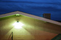
Angel shaped lightby MadMan2kComment by Prof_Fate: I like this, very graphic and striking, the yellow and blue contrast nicely, the roof eave makes a nice line. If the center-ish railing was more prominent maybe - i like the shodow. The steps on the right could go though - they add nothing to the image. |
| Photographer found comment helpful. |
| 12/17/2005 02:07:44 AM |
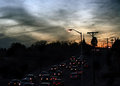
Sunset in Farmingtonby MadMan2kComment by Prof_Fate: the sky is pretty and i like the ecffect of the car lights. the poles and wires are unattractive. the way the traffic is bunched up to the left of the image hurts the composition as well IMO. A solid traffic jam would be better - umm, artistically wise anyway. |
| Photographer found comment helpful. |
| 12/17/2005 02:05:33 AM |
20th Streetby MadMan2kComment by Prof_Fate: I kind of like the harsh contrast. Two things jump out at me - the bottom needs cropped a bit - the guardrail/curb is distracting and adds nothing to the image. I like the horizontal placement of the subway sign, but vertially it sits smack in the middle of image and that bothers me. Not sure about the church in the upper right. Perhaps try retaking from a slightly different position - try more sky, or more road and move the subway sign up or down a bit. |
| Photographer found comment helpful. |
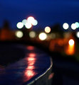
| 12/17/2005 02:02:49 AM |
Focusby MadMan2kComment by Prof_Fate: a bit noisy in the sky. I like the lights and the streak on teh wet road, but there needs to be something in the foreground IMO - a neon hotel sign pops into my mind for example. |
| Photographer found comment helpful. |
| 12/17/2005 02:01:25 AM |
Doorby MadMan2kComment by Prof_Fate: I like the color, might look good ina moody b&w. Perhaps crop the right side to lose the wall and light. the light fights with teh MEN on the door for my attention. |
| Photographer found comment helpful. |
Home -
Challenges -
Community -
League -
Photos -
Cameras -
Lenses -
Learn -
Help -
Terms of Use -
Privacy -
Top ^
DPChallenge, and website content and design, Copyright © 2001-2026 Challenging Technologies, LLC.
All digital photo copyrights belong to the photographers and may not be used without permission.
Current Server Time: 07/16/2026 09:49:48 PM EDT.