| Image |
Comment |
| 03/27/2004 01:35:08 AM |
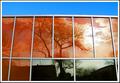
Reflectionsby flip89Comment by Hax0r: I have no idea how you achieved this. The orange and blue are great complementors. And the transition of the reflection from gray to orange is entertaining. Even the sun behind the clouds is not badly overexposed like one would expect. Good work and it shows. |
 Photographer found comment helpful. Photographer found comment helpful. |
| 03/26/2004 08:29:36 PM |
Reflectionsby flip89Comment by Tranquil: This was definitely one of my favorites, I actually have a shot very similar but with different color combinations. |
| Photographer found comment helpful. |
| 03/26/2004 12:12:04 PM |
Metropolisby flip89Comment by Dave Gordon: Nice shot, and a good magazine cover, with a vertical format and space at the top that could carry type without spoiling the picture. |
| Photographer found comment helpful. |
| 03/26/2004 03:34:16 AM |
Metropolisby flip89Comment by pcody: I get a feeling of designed chaos from this picture. All the textures and shapes are great. At first, I didn't like how the post processing flatened out all the details, but as I have looked, I can see how they add to the purely graphic presentation. I think a stark contrast would make this more graphic. |
| Photographer found comment helpful. |
| 03/25/2004 11:13:30 PM |
Amature Hucksterby flip89Comment by dr rick: Greetings from the Critique Club!
The message
This is a nice portrait. The camera makes it clear that the subject is a photographer, and the low key and hiding most of the face behind the camera and hands give it an air of mystery. The one eye that is visible is expressive; this is a serious photographer.
Creative choices
The natural light is very effective; it nicely lights the one side and leaves most of the image in shadow, producing a good low key image (although I find the bright reflection on the camera distracting). Black and white works well. I don't like the vertical line on the left side (edge of the mirror?) or the horizontal lines in the background, and there is a somewhat distracting line at bottom center.
Technical aspects
Focus and exposure are just right. Tonal range is appropriate for the low key approach. Sharpness is just right. |
| Photographer found comment helpful. |
| 03/25/2004 06:24:05 PM |
|
| Photographer found comment helpful. |
| 03/25/2004 05:53:42 PM |
|
| Photographer found comment helpful. |
| 03/25/2004 05:42:04 AM |
|
| Photographer found comment helpful. |
| 03/25/2004 03:19:40 AM |
Reflectionsby flip89Comment by nordic: less of the blue at the top would have made your picture even better IMO, nice idea. |
| Photographer found comment helpful. |
| 03/24/2004 11:07:00 PM |
Reflectionsby flip89Comment by piwoguy: Great composition, and your border adds a bit to the photo overall. Could be a little cleaner if you took the shot from an angle where the lines don't curve or slant a much. |
| Photographer found comment helpful. |
Home -
Challenges -
Community -
League -
Photos -
Cameras -
Lenses -
Learn -
Help -
Terms of Use -
Privacy -
Top ^
DPChallenge, and website content and design, Copyright © 2001-2026 Challenging Technologies, LLC.
All digital photo copyrights belong to the photographers and may not be used without permission.
Current Server Time: 07/17/2026 01:38:07 PM EDT.