| Image |
Comment |
| 11/05/2003 06:12:01 PM |
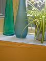
Blue Bottlesby richyComment by jackditch: resize photo. too small. i think if it was larger, it would be quite nice. i also would have invcluded the tops of the vase. |
 Photographer found comment helpful. Photographer found comment helpful. |
| 11/05/2003 02:03:38 PM |
Blue Bottlesby richyComment by Neuferland: A good idea but the cropping and size of the shot hurts the overall shot for me. The tan across the bottom is very distracting and the green bottle is also taking away from the shot for me. Perhaps with just the blue bottle and the plant on a darker background, with a back light? A 3 as is |
| Photographer found comment helpful. |
| 11/05/2003 08:56:38 AM |
|
| 11/05/2003 08:32:57 AM |
Blue Bottlesby richyComment by ScantyNebula: If the bottles are supposed to be the focal point here (which is suggested by the title) you should have at least included the whole objects in the photo rather than cut off the tops ..
The picture is a little too small for my taste
There are just too many subjects here, its poorly arranged |
| Photographer found comment helpful. |
| 10/30/2003 02:32:21 PM |
|
| 10/21/2003 07:22:41 AM |
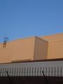
Urban Skyby richyComment by OneSweetSin: *Critique Club*
This photo is very boring has nothing that really stands out to get your attenion. The colors here are only so so. You can only see part of the building and it isn't even enough to tell you what it is.
As for meeting the challenge, no not really the challenge was Urban LANDSCAPE! Meaning there should be some kind of actual landscape in the photo not just part of a building.
The strong point of your photo is the lines the building creates, could have made the photo strong if there was something to look at like a window or plant anything even a person in the photo. |
| 10/13/2003 06:38:47 PM |
|
| Photographer found comment helpful. |
| 10/11/2003 08:04:15 PM |
Urban Skyby richyComment by Imagineer: This needed rotating so that the verticals were straight.Colours are good but could be enhanced with an increase in contrast. |
| Photographer found comment helpful. |
| 10/11/2003 07:27:18 AM |
Urban Skyby richyComment by pcody: You have a good combination of elements here. I don't know why, but they don't add up to an interesting picture. Maybe a different point of view would have worked better. |
| Photographer found comment helpful. |
| 10/10/2003 12:04:56 PM |
|
Home -
Challenges -
Community -
League -
Photos -
Cameras -
Lenses -
Learn -
Help -
Terms of Use -
Privacy -
Top ^
DPChallenge, and website content and design, Copyright © 2001-2026 Challenging Technologies, LLC.
All digital photo copyrights belong to the photographers and may not be used without permission.
Current Server Time: 07/15/2026 11:52:44 AM EDT.