| Image |
Comment |
| 06/14/2009 09:35:21 PM |
Depthby miaryComment by bvy: The composition is great, but the processing is problematic. I can't say exactly why though. The colors are off and there's some strange noise on the ceiling. It's also very soft. |
 Photographer found comment helpful. Photographer found comment helpful. |
| 06/14/2009 10:46:21 AM |
Depthby miaryComment by Lydia: This seems over processed to me. I like the composition very much. But, the image quality is too poor to score really well, I fear. Look at the ceiling... Still, there is much to be said for perfect composition. You have 'the eye'. :) |
| Photographer found comment helpful. |
| 06/12/2009 12:25:13 AM |
Depthby miaryComment by kenna718: the angle is good, but the light and color seem a little blown out |
| Photographer found comment helpful. |
| 06/11/2009 09:34:11 AM |
Depthby miaryComment by npasel: Nice image for this challenge. How did you keep the focus so clear for that distance? |
| 06/07/2009 02:16:16 AM |
|
| Photographer found comment helpful. |
| 06/03/2009 09:16:39 PM |
|
| Photographer found comment helpful. |
| 06/03/2009 05:41:12 PM |
|
| Photographer found comment helpful. |
| 06/02/2009 01:52:00 PM |
|
| Photographer found comment helpful. |
| 05/31/2009 09:32:54 PM |
|
| 05/31/2009 11:33:11 AM |
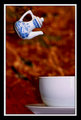
Sometimes life's circumstances seem utterly disproportionate--for better or for worseby miaryComment by salmiakki: Greetings from the Critique Club
I am sorry that this image did not score a bit higher for you in the miniature challenge. I personally thought it met the challenge topic very well.
From a technical point of view, the mini tea pot is quite out of focus which I do not think is very helpful when trying to score high in these challenges. Other things that have likely contributed to a lower score are the background and the border.
It was mentioned already in the comments made during the challenge that the background was somewhat distracting, and I do have to agree with this. A plain background would likely have worked much better.
Then we come to the border. I have observed that heavy borders such as the one you have used here, hurt rather than help scores here on DPC. Typically a border should enhance the overall image presentation and in this case, I do not really believe it does. Something a little less in your face may have worked better.
At the end of the day, I still gave this a 6 as I felt the subject worked well in this challenge. A better focus would undoubtedly have increased my score.
|
Home -
Challenges -
Community -
League -
Photos -
Cameras -
Lenses -
Learn -
Help -
Terms of Use -
Privacy -
Top ^
DPChallenge, and website content and design, Copyright © 2001-2026 Challenging Technologies, LLC.
All digital photo copyrights belong to the photographers and may not be used without permission.
Current Server Time: 07/16/2026 11:12:30 PM EDT.