Beadedby
GraciousComment by stephan: Greetings from the Critique Club, Grayce.
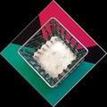
Composition: I like this most. The nested patterns are a nice abstract and especially the 45 degree rotation makes this is a nice eye catcher. The strange foam sheets carry this idea on very nicely. I don't know if you made the sheets yourself or if you bought it like that, but the strange lines and the contrast between colour/black is nice.
Personally I find one thing distracting and that's the view on the candle holder. It's almost perfectly from straight above, but there is a small angle which makes the 4 walls seen differently (one side smaller, another side bigger). I guess it's because the rest of the photo looks sp very geometrically accurate that this looks like a flaw. The perspective gives the subject depth, but I think a more flat look would work better for such an abstract 2D pattern.
Lighting: First, I think the lighting could be better. The colours are a bit dull and I also don't like the shadow of the candle holder. A more uniform lighting from all sides, without any shadow would work better.
While playing around with oyur photo in my image editor I noticed that when inverting the colours, they look like the green-white-red italian flag. I think this (or a different hue) would have had a much higher impact.
Focus: As far as I can see everything is in the same focus (small aperture?). This was a good choice because a narrow DOF, suggesting depth, would hurt the abstract look in my opinion.
Challenge: Yes. The photo certainly fulfills the challenge.
Creativity: To me the subject looks a bit boring. But even boring subjects can be made look interesting. If that was the intent (was it?) then I want to say "way to go!". I like abstract photos :-)
Overall opinion: Personally I don't like the overall result, but there are some nice elements I really appreciate.
Message edited by author 2003-02-09 20:17:57.