Nikeby
ArnayComment by Neil: Critique Club:
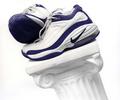
This is a good, sharp, generally well exposed image. It's well composed, offering the focal point (shoes) close enough to the upper left intersecting thirds gridlines. It offers a nice duotone-like image with the predominately blue and white theme.
I think the choice to slant the pillar is key here, and a good design. I think even a little more pitch on the slant might have been a little more interesting, giving you a bisecting diagonal composition.
Small relatively non-significant issues here: the center bottom of the column is slightly hot; the bottom of the right shoe could have more shadow detail.
I am not sure what the real message is here; if a product shot, I am not sure the placement of the shoes would sell; if an artsy shot, I am not totally convinced it would "sell"; if it's a shot for running or sports enthusiasts, I think it would work very well for those who like nikes.
Overall, I think its done very well.