| Image |
Comment |
| 07/03/2004 03:02:57 AM |
|
 Photographer found comment helpful. Photographer found comment helpful. |
| 07/03/2004 02:16:31 AM |
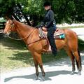
Samantha's Challengeby NeuferlandComment by David.C: Lighting: The natural light is nice, but the heavy shadows, especially across the eyes detracts greatly from the photo. The shadows and the lack of a catchlight hide the expressiveness of the eyes.
Pose: The rider and horse are both posed well, but the image needed to be rotated clockwise a bit. As it is they look as if they are about to pitch forward.
Background: The background does not appear to have been planned for a studio portrait, ranging from too dark to decern detail and very hot bright areas. |
| Photographer found comment helpful. |
| 07/02/2004 08:02:22 PM |
Samantha's Challengeby NeuferlandComment by cbeller: I'm sure you've heard this already, but IMHO, this doesn't meet the challenge. Sorry. Nice photo, but the bottom right looks a bit blown out. |
| Photographer found comment helpful. |
| 07/02/2004 12:30:59 PM |
|
| Photographer found comment helpful. |
| 07/02/2004 08:35:22 AM |
|
| Photographer found comment helpful. |
| 07/02/2004 06:32:14 AM |
Samantha's Challengeby NeuferlandComment by soccerdad: This is a good outdoor portrait, and captures a bit of your subject very well. Only thing I can think to recomend is that you use a little less DOF to reduce emphasis on the background. |
| Photographer found comment helpful. |
| 07/01/2004 11:29:38 PM |
Samantha's Challengeby NeuferlandComment by L1: This really isn't what comes to mind when considering a "studio portrait" IMHO. It is a good picture of the young lady and the horse, however some of the highlights are a bit blown out. The shadow cast on her face from the hat is a bit distracting as well. :o) |
| Photographer found comment helpful. |
| 07/01/2004 07:58:01 PM |
|
| Photographer found comment helpful. |
| 07/01/2004 06:29:18 PM |
Soft Eleganceby NeuferlandComment by moodville: The black and white seems a little wishy-washy and could probably do with more contrast to really darken the blacks that seem fairly grey to me. The close, full-frame shot is good, but the background still seems to be a major part of the image. The petals also lack a little texture and I'm guessing it was likely slightly overexposed. The soft focus helps make it look more delicate but I think having the middle bits (stamen?) be in focus could help balance it out more. |
| Photographer found comment helpful. |
| 07/01/2004 02:59:13 PM |
|
| Photographer found comment helpful. |
Home -
Challenges -
Community -
League -
Photos -
Cameras -
Lenses -
Learn -
Help -
Terms of Use -
Privacy -
Top ^
DPChallenge, and website content and design, Copyright © 2001-2026 Challenging Technologies, LLC.
All digital photo copyrights belong to the photographers and may not be used without permission.
Current Server Time: 06/17/2026 01:07:31 PM EDT.