| Image |
Comment |
| 03/29/2004 12:04:13 AM |
|
| 02/17/2004 10:20:11 PM |
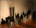
Shadows Of The Past by HomunculusComment by brewinj: Compelled me emotionally first time I saw this. I was truly captivated by the simplicity of your model and then by how it drew me into the shadows. Speaks volumes. Great job! |
| 11/16/2003 10:37:54 AM |
Shadows Of The Pastby HomunculusComment by wwjdwithca: Didn't know the rules when I made my post.....You couldn't remove the foreground shadows, against the rules.
My Bad!
Nice pic, and just reminds me how you don't always need to obsess over the details to have an excellent pic. |
| 11/11/2003 07:55:09 PM |
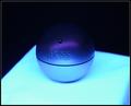
HUGO BOSSby HomunculusComment by heida: I like the purple lightning in this one , would mabey have been better to have the table in focus too, mabey not... good job - 8 |
| 11/11/2003 05:41:27 PM |
HUGO BOSSby HomunculusComment by adine: Nice glowing effect. Wish there was more difference between the dark blue and the black - perhaps a backlight to highlight the edge of the ball? |
| 11/10/2003 08:32:48 PM |
|
| 11/09/2003 01:47:38 PM |
Shadows Of The Pastby HomunculusComment by wwjdwithca: I love this image, but either you made a huge (in my mind) technical mistake, or I'm missing the point:
The shadows being present signify that even though they are gone, they are still in our hearts and minds, and cannot be removed which is signified by the beacon.
Very cool, but should their be shadows of the twin towers in the foreground? Seems like a significant mistake. |
| 11/08/2003 06:28:13 PM |
HUGO BOSSby HomunculusComment by banmorn: Though the top of the boss piece appears to blend into the background it is still discernible which I like a lot. The lighting is extremely good. I would normally chastize for the centering of the subject, but the composition get a plus for the angle of the light area.... |
| 11/08/2003 10:51:23 AM |
|
| 11/06/2003 11:30:21 AM |
HUGO BOSSby HomunculusComment by ScantyNebula: Very nice colors, I like the soft touch. I think it would also look nice if the bottom surface was straight and when the whole way across the photo, rather than on the angle. What I like the most is the colors.. 7 |
Home -
Challenges -
Community -
League -
Photos -
Cameras -
Lenses -
Learn -
Help -
Terms of Use -
Privacy -
Top ^
DPChallenge, and website content and design, Copyright © 2001-2026 Challenging Technologies, LLC.
All digital photo copyrights belong to the photographers and may not be used without permission.
Current Server Time: 07/16/2026 10:08:04 PM EDT.