| Image |
Comment |
| 08/04/2004 11:13:18 AM |
|
 Photographer found comment helpful. Photographer found comment helpful. |
| 08/04/2004 02:16:23 AM |
New Revolutionby RoosterComment by lukaz: Good colors and sharp image, but the miniature should be in another positions, showing the wheels |
| Photographer found comment helpful. |
| 08/03/2004 12:49:45 PM |
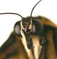
Boo!by RoosterComment by photom: Now that's a close-up. HAs to be way more than 1:1 gIven the magnification, you've handled the DoF very well. |
| Photographer found comment helpful. |
| 08/03/2004 12:18:47 PM |
Boo!by RoosterComment by Dr.Confuser: Great image. I am fascinated why the square image and centered subject work. I think it might have to do with the eye discounting or deducting the white space. The remaining image then has a different balance and subject placement. Whatever the reason, this is a nice image, well captured. Reminds me of Godzilla vs Mothra. |
| Photographer found comment helpful. |
| 08/02/2004 05:56:21 PM |
|
| 08/02/2004 03:28:04 AM |
Boo!by RoosterComment by willem: Nice detail but quite a lot of dirt/water on the eyes. Gives the impression that it is dead. |
| Photographer found comment helpful. |
| 08/02/2004 02:52:41 AM |
|
| Photographer found comment helpful. |
| 08/02/2004 12:49:49 AM |
|
| Photographer found comment helpful. |
| 07/31/2004 02:03:31 PM |
Dark Punk Colonyby RoosterComment by Imagineer: Nice idea but too washed out. Over exposure's fine but it really needs to have solid black and pure white at both ends of the scale. In this instance you need to reflect some angst so more dominant, heavy contrast would work better. Type is pretty good and nicely layed out. |
| Photographer found comment helpful. |
| 07/30/2004 03:31:15 PM |
|
| Photographer found comment helpful. |
Home -
Challenges -
Community -
League -
Photos -
Cameras -
Lenses -
Learn -
Help -
Terms of Use -
Privacy -
Top ^
DPChallenge, and website content and design, Copyright © 2001-2026 Challenging Technologies, LLC.
All digital photo copyrights belong to the photographers and may not be used without permission.
Current Server Time: 07/22/2026 05:38:53 PM EDT.