| Image |
Comment |
| 05/11/2005 08:20:34 AM |
Geometry in Steel by NeilComment by ergo: One of the first wow pictures of this challenge-vote round for me, and it's very striking. I like the shifting color tones a lot, and the reddish tint on the right side is very evocative in terms of mood. I can't help but think that this would also have scored well with me in the upcoming silhouette challenge. If there were complaints to be made, I'd say the tuft of cloud and little flare on the upper left, and the reflection on the water surface, which could have been burned in some more. But alas, it's basic edit, and given the parameters, I'll still score this my first 10 of the challenge. Thanks. |
 Photographer found comment helpful. Photographer found comment helpful. |
| 05/11/2005 07:12:26 AM |
|
| Photographer found comment helpful. |
| 05/08/2005 09:44:20 PM |
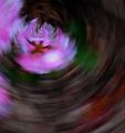
Garden Waltzby NeilComment by spvanderm: I'm not a big fan of motion-blur photography, but I can appreciate it for what it is. I like the colors and that the pistil/stamen (?) of the flower is visible |
| Photographer found comment helpful. |
| 05/08/2005 08:43:05 AM |
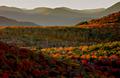
Autumn Tapestryby NeilComment by docpjv: still thinks it is a waterpainting done by a master.. fabulous scenery, great capture. |
| Photographer found comment helpful. |
| 05/08/2005 01:17:31 AM |
Autumn Tapestryby NeilComment by Art Roflmao: Suh-weet image, Neil! I love the contrast and colors. Twas before my membership, but I'd have given it a 10. |
| Photographer found comment helpful. |
| 05/07/2005 06:57:47 PM |
|
| Photographer found comment helpful. |
| 05/06/2005 09:49:36 PM |
Garden Waltzby NeilComment by buzzmom: i like the affect this effect has on this photo...this is how i feel after out planting in the hot sun too long |
| Photographer found comment helpful. |
| 05/06/2005 11:33:24 AM |
Garden Waltzby NeilComment by cpanaioti: Camera movement during exposure can produce some very interesting effects. This image feels a little out of balance. This could be due to the juxtaposition of the light and dark areas of the image. In general, light areas on top and dark areas on the bottom work best however in this image I think having the lighter area in the bottom right would improve the impact of the image. |
| Photographer found comment helpful. |
| 05/06/2005 11:19:54 AM |
Garden Waltzby NeilComment by sfalice: Lovely use of color and perfect that you kept the center of interest tack sharp. |
| Photographer found comment helpful. |
| 05/06/2005 10:18:47 AM |
Garden Waltzby NeilComment by SandyP: Very cool! The color of that beautiful purple in the darker colors is so striking! |
| Photographer found comment helpful. |
Home -
Challenges -
Community -
League -
Photos -
Cameras -
Lenses -
Learn -
Help -
Terms of Use -
Privacy -
Top ^
DPChallenge, and website content and design, Copyright © 2001-2026 Challenging Technologies, LLC.
All digital photo copyrights belong to the photographers and may not be used without permission.
Current Server Time: 07/24/2026 03:39:51 AM EDT.