| Image |
Comment |
| 09/21/2005 01:47:27 PM |
Surf's Up!by lentilComment by Elemmennope: To me it's really the surfer himself that is the subject, and with that in mind he looks too centered to be following the rule of thirds. I think the placement would have had a bit more impact if it was zoomed out a bit and the subject was in the lower right, facing into the frame instead. As he is here, the line of the surfboard leads your eyes right out of the frame. |
 Photographer found comment helpful. Photographer found comment helpful. |
| 09/21/2005 02:16:43 AM |
Surf's Up!by lentilComment by Bear_Music: While the surf line lies roughly on a 1/3 horizontalline, the subject of the image is centered; does not answer the challenge to "use rule of thirds" Nice action though :-) |
| Photographer found comment helpful. |
| 09/20/2005 05:59:35 AM |
|
| 09/19/2005 05:55:11 AM |
|
| Photographer found comment helpful. |
| 09/18/2005 11:28:53 PM |
|
| Photographer found comment helpful. |
| 09/18/2005 11:02:59 PM |
|
| Photographer found comment helpful. |
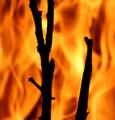
| 09/17/2005 10:34:50 PM |
Fiery contrastby lentilComment by HBunch: *Critique Club*
Reminds me of a shot Konador did. I think this qualifies as High Contrast. We got bright brights and dark darks. The lines near the upper left of the flames are a bit of a distraction to me since they are so close to the face and actually go through the face in a couple parts. Was this challenge advanced editing? I can't remember. I would have cloned the lines out of this shot.
Focus is soft, which I'm sure is intended due to the slow shutter speed. I think it works here for what I think you were trying to achieve. Without much details, I'm not really sure if that's your intent, but I assume it was.
This kind of shot really isn't my own personal cup of tea, however, it is neat and does draw attention and also is visually appealing.
Colors are really nice. I like the brightness of the bottom half of the photo with the darkness of the top half.
The face showing through the fire creates interest, but the lines are quite a distraction, that they almost overpower the face in my opinion.
~Heather~ |
| 09/17/2005 11:08:11 AM |
Higher Perspectiveby lentilComment by zarniwoop: There's too much stuff. This kind of shot is a lot harder to do than you'd think. Well at least I've always found them hard to get right. |
| 09/16/2005 08:15:54 PM |
Feeling Blue?by lentilComment by jpochard: I wouldn't change a thing about this one. I'm very surprised that it didn't finish higher. Nice soft color and lighting, I even like the shadow behind the flower as it separates it from the background. Great job. |
| 09/16/2005 08:10:06 PM |
Anyone for a "light" lunch?by lentilComment by jpochard: A nice idea and well done. For more impact, I think less would have been more. A closer composition down on the plate, without the silverware or candle would be interesting to see. |
Home -
Challenges -
Community -
League -
Photos -
Cameras -
Lenses -
Learn -
Help -
Terms of Use -
Privacy -
Top ^
DPChallenge, and website content and design, Copyright © 2001-2026 Challenging Technologies, LLC.
All digital photo copyrights belong to the photographers and may not be used without permission.
Current Server Time: 04/01/2026 08:33:26 PM EDT.