| Image |
Comment |
| 05/03/2006 08:29:45 PM |
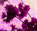
Profiles of Purpleby KelliComment by DanSig: [[Trading Post]]
I think this image has potential, even though it scored so low.
the balance between purple and yellow is perfect, yellow is a very dominant color and has to be used with caution, but what I find wrong is the lighting, there's just too much shadow in the flowers, but not enough to make it look like it was intentional.
since this is a flower picture people want to see all the fine details, but your aperture is way to big to show any details, try shooting again at f8-f16 and use a tripod, and try using ISO 100. just lower the speed to compensate. I think the image would pop out and be really nice just by increesing the DOF.
hope this helps. |
 Photographer found comment helpful. Photographer found comment helpful. |
| 05/03/2006 05:12:42 PM |
Profiles of Purpleby KelliComment by tngrndream: hello,
sorry, but i beat this one down. probably more of a me thing than anything else. i did not think the soft focus mixed with the bright (backlit?) flowers. i thought those should have been the whole point and that they should have been spot on. it seems the background was the whole point now that i am looking at it again. i say the bg was the point because that is where the focus seems to be and that is where the actual complimentary colors seems to be.
it seems that this would have worked better, imho, ifn you were to leave the flowers (sharp) and have just a yellow bg. maybe. i also think that maybe ifn you would have flipped it (so the diagonal went from bottom left to upper right) i think i heard that is the way the natural tendancy for the eye to veiw the frame. unsure about that but i am pretty sure that is right. |
| Photographer found comment helpful. |
| 05/03/2006 03:57:26 PM |
|
| Photographer found comment helpful. |
| 05/03/2006 03:04:53 PM |
Profiles of Purpleby KelliComment by Louis: It's a tad lacking in focus, both compositionally and photographically. I can see how the flowers seem to be growing from the direction of the lower right corner to the lower left. Perhaps if you had pulled the frame back a bit to show more of this, the effect would have been better. As well, the complementing nature of the colours isn't effectively emphasized with the background you selected. Pretty overall though. :) |
| Photographer found comment helpful. |
| 05/03/2006 01:15:38 PM |
|
| Photographer found comment helpful. |
| 05/03/2006 12:35:32 PM |
Profiles of Purpleby KelliComment by timfythetoo: This didnt work well for me. The focus is not good and the colors are oversaturated. Just not enough detail in the flowers and the background is just too distracting and odd. The actual setup and placement of the flowers works - good angle and empty space around - but not enough to give it a better score. (I hope that didnt sound too harsh - just my opinion). |
| Photographer found comment helpful. |
| 05/03/2006 10:36:08 AM |
|
| Photographer found comment helpful. |
| 05/03/2006 10:28:18 AM |
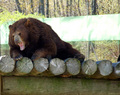
Careful, I spitby KelliComment by GuGi: I would have loved to see more of the animal and the background colours would have benefitted if you hade worked a bit on them. The idea and title are good. |
| Photographer found comment helpful. |
| 05/03/2006 09:49:48 AM |
Let sleeping bears lie...or else!by KelliComment by eschelar: This would probably be nicer and more potent if it were cropped in much tighter to the bear's face. Looks a bit too much like a zoo pic with this DOF too.. Probably not much you could do about that though.
I would like to see more of the bear's face.
It might even be worthwhile to use a square crop and leave off the somewhat relaxed looking back foot to make it look more like the bear is climbing over a log barrier or something? |
| Photographer found comment helpful. |
| 05/03/2006 07:29:34 AM |
|
| Photographer found comment helpful. |
Home -
Challenges -
Community -
League -
Photos -
Cameras -
Lenses -
Learn -
Help -
Terms of Use -
Privacy -
Top ^
DPChallenge, and website content and design, Copyright © 2001-2026 Challenging Technologies, LLC.
All digital photo copyrights belong to the photographers and may not be used without permission.
Current Server Time: 06/22/2026 04:42:36 PM EDT.