| Image |
Comment |
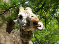
| 05/08/2006 02:43:07 AM |
Careful, I spitby KelliComment by chalice: LOL. This animal reminds me of that old puppet "lambchops" (probably because of the expression). This has a snapshot quality about it, which may account for the score from "all users". A little more composition might have helped. |
 Photographer found comment helpful. Photographer found comment helpful. |
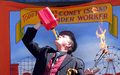
| 05/08/2006 02:38:55 AM |
Kook sets fire to Coney Islandby KelliComment by chalice: Nice placement of the central figure. The colors seem a bit faded to me (chiefly because gas containers are usually a vivid red and this one seems a bit washed out - of course it could be the sunlight, too). Good sense of humour in this one. |
| Photographer found comment helpful. |
| 05/08/2006 02:31:06 AM |
Careful, I spitby KelliComment by ericwoo: --Trading Post Comment--
Great coloring here and excellent focus, but I think you picked a subject that is a bit too common for a free study. These are the toughest of all challenges to do well in, and I normally avoid them. This one makes me chuckle, and the composition is very nice. I still believe that it should have scored better, and well above a 5, but voters on here are hard to figure out most days. I think you'd have done better if you would have isolated the llama against the sky and left out that tree line that's centered in the frame. |
| Photographer found comment helpful. |
| 05/08/2006 01:48:07 AM |
Kook sets fire to Coney Islandby KelliComment by ericwoo: --Trading Post Comment--
Very interesting. You have several elements working together in this shot to keep the eye moving all around the frame. You've captured a very interesting scene, and your placement of the actor is priceless. Nice background hair. The shot immediately gave me a smile. I think it could have been better without the harsh lighting on his face, but we can't control everything. Nice score. |
| Photographer found comment helpful. |
| 05/07/2006 10:14:32 PM |
|
| Photographer found comment helpful. |
| 05/07/2006 08:47:39 PM |
|
| Photographer found comment helpful. |
| 05/07/2006 08:36:24 PM |
|
| Photographer found comment helpful. |
| 05/07/2006 07:39:21 PM |
|
| Photographer found comment helpful. |
| 05/07/2006 03:45:16 PM |
|
| Photographer found comment helpful. |
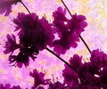
| 05/07/2006 11:24:34 AM |
Profiles of Purpleby KelliComment by kirsty_mcn: First, to get it out the way, although I didn't vote, I'm one of the people who thinks there is definitely too little yellow, and what yellow there is seems rather arbitrary rather than an integral part of the composition - I wouldn't have voted it high in this challenge.
Other than that, I think the main thing that hurts the photo is the lighting - its very hard to make out any detail in the flowers, especially those facing us, and the purple is very flat. I'd suggest trying to light from the front a little, at an angle, just experimenting to see what enhances the tones & shapes in the flowers.
The diagonal composition works well, but it does seem veeeery busy - I guess thats partly a characteristic of those particular flowers, but I'm sure it could have been made a little less busy by arranging them differently or even breaking of some of them flowers. Simple compositions nearly always work best.
Hope that helps |
| Photographer found comment helpful. |
Home -
Challenges -
Community -
League -
Photos -
Cameras -
Lenses -
Learn -
Help -
Terms of Use -
Privacy -
Top ^
DPChallenge, and website content and design, Copyright © 2001-2026 Challenging Technologies, LLC.
All digital photo copyrights belong to the photographers and may not be used without permission.
Current Server Time: 06/22/2026 06:07:02 PM EDT.