| Image |
Comment |
| 12/04/2003 06:15:47 PM |
|
 Photographer found comment helpful. Photographer found comment helpful. |
| 12/03/2003 12:58:34 PM |
|
| Photographer found comment helpful. |
| 11/28/2003 08:21:35 PM |
Give Him Enough Rope And He'll Hang Himselfby BeagleboyComment by dr rick: Greetings from the Critique Club!
This image conveys a very clear message. The dark tones, blue color, and the model's pose all indicate depression. The noose shows the portent of his thoughts, and using it to frame the subject works really well. The shadow adds drama. Overall, a great photo, and perfect for the Literalisms challenge.
Since you did request a critique, let me point out the minor and barely noticable weaknesses. There are indentations in the carpet where the furniture was before you moved it out of the way for the photo. There are apparent compression artifacts around many of the edges (did you use jpeg to go to and from NeatImage?). And parts of the chair legs and baseboard seem a bit oversaturated. The red lamp makes this basically monochrome; the Colorize option of Hue/Saturation may have worked a little better than Color Balance to avoid this. |
| Photographer found comment helpful. |
| 11/17/2003 08:43:26 PM |
|
| Photographer found comment helpful. |
| 11/17/2003 10:33:30 AM |
|
| Photographer found comment helpful. |
| 11/17/2003 03:32:22 AM |
Give Him Enough Rope And He'll Hang Himselfby BeagleboyComment by Miah: sheesh.. that rope is OBVIOUSLY too close to the ground to hang from.. hehe, of course i'm kidding.. the blue seems the obvious choice, i would have liked to see this in pink... you'd really confuse some people. |
| Photographer found comment helpful. |
| 11/17/2003 01:40:09 AM |
|
| Photographer found comment helpful. |
| 11/17/2003 12:44:12 AM |
Give Him Enough Rope And He'll Hang Himselfby BeagleboyComment by moodville: I like how the color suits the mood of the image. Using the noose as a frame is also good. Shame about the line near the top, which I assume is the start of the ceiling. His right shoulder (on our left) blends into the background a little, and that whole left area seems a little dark compared to the brigher blue on the other side. A creative idea that is well executed. Well done. |
| Photographer found comment helpful. |
| 11/16/2003 09:24:09 PM |
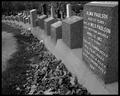
Titanic Cemeteryby BeagleboyComment by Neuferland: This is a lovely shot, the black and white works very well for this, the angle is also well done, the way the headstones lead down through the shot is very well done. The overall shot seems a bit dull though, maybe just a touch more contrack to make it pop a little more? Just a touch. I started this at a 6 but am going to an 8 |
| Photographer found comment helpful. |
| 11/16/2003 10:58:11 AM |
|
| Photographer found comment helpful. |
Home -
Challenges -
Community -
League -
Photos -
Cameras -
Lenses -
Learn -
Help -
Terms of Use -
Privacy -
Top ^
DPChallenge, and website content and design, Copyright © 2001-2026 Challenging Technologies, LLC.
All digital photo copyrights belong to the photographers and may not be used without permission.
Current Server Time: 07/17/2026 12:34:03 PM EDT.