| Image |
Comment |
| 08/26/2002 08:55:00 AM |
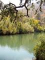
Swimming Holeby bobgaitherComment by 2ndgear: I fell in love with this picture when I saw it because it reminded me of my swimming hole..I think everyone who sees this will get the same feeling I did. |
| 08/25/2002 01:22:00 AM |
|
| 08/23/2002 08:31:00 AM |
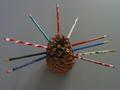
Family Treeby bobgaitherComment by floyd: Seems a little dark. Perhaps another light from the front would have brought out the texture of the pine cone more. |
| 08/22/2002 08:21:00 PM |
Family Treeby bobgaitherComment by autool: Composition: Subject Placement, Cropping, Background6, Technical: Focus, Exposure, Lighting, Processing7, Challenge: Does your entry meet it?10, Appeal: Is it Interesting, Motivating, Etc.? 4, Total Averaged Rating7. Autool |
| 08/22/2002 10:16:00 AM |
Family Treeby bobgaitherComment by HBunch: The focus on that pine cone is really great. You did a very nice job staggering color of the pencils. Lighting is very good. no distracting shadows or bright spots. the only thing that might be kind of distracting is there is a small black dot in the upper left corner. Otherwise, very creative. Good luck in the challenge. |
| 08/21/2002 09:05:00 PM |
Family Treeby bobgaitherComment by RedRuthann: Cute idea. I'm being straight forward - NOT to offend. There are a few things I would adjust. I'm not sure that having the light source entering from the top right is effective here. I'm not sure if the background is actually grey, or was supposed to be black - either way, I would have chosen something different. Also, perhaps a different placement and angle - in effort to make the form stand out - to me, this is more of just a 'picture' not a photograph. Perhaps having the lightsource a little brighter as well as positioned differently, I would say on the side or in the front - show off the pine cone. I am in no way an expert, just expressing my thoughts. 4 Ruthann |
| 08/20/2002 07:37:00 PM |
|
| 08/20/2002 10:29:00 AM |
|
| 08/19/2002 06:27:00 PM |
|
| 08/19/2002 09:28:00 AM |
Family Treeby bobgaitherComment by BigSmiles: What a great idea! They grey background makes everything look duller... a white one may have helped the pencils to pop out a bit more. Great shot anyway! |
Home -
Challenges -
Community -
League -
Photos -
Cameras -
Lenses -
Learn -
Help -
Terms of Use -
Privacy -
Top ^
DPChallenge, and website content and design, Copyright © 2001-2026 Challenging Technologies, LLC.
All digital photo copyrights belong to the photographers and may not be used without permission.
Current Server Time: 07/18/2026 06:18:34 PM EDT.