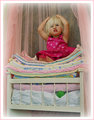
The Princess and the Pea...."Why is this bed so uncomfortable?!?!"by
kellmak10Comment by FrankRobinson: Hi, Critique Club checking in at your request! I will say that this is all completely subjective, so I hope you find something useful in here.
Overall impression, this is a very cute take on the theme. Baby/Child shots are a marmite subject on this site, some love them and some hate them no matter how good the shot. That explains a lot of the ones and twos for me. There are a couple of things I might have done differently.
Technically: The Depth of Field is good here, which is surprising at f3.5. I'm guessing you were shooting pretty much at the wide end? Equally the focus is spot on, with your model's face nicely sharp. The lighting is tricky - with all of the white of the bed and mattress, the bottom half of the picture is a lot lighter than the top, where your subject sits and I confess to finding it a little distracting on the eye.
Artistically: This is
really subjective! It is a strong basic composition, and I like your use of the pink netting to isolate the 'set' from the background. The mass of different bedding colours however I find a little 'busy' - again stealing a little impact from the superb acting you are getting from your model. Her pose is excellent, and her expression is bang on - nothing you could want to change there!
PP: For an advanced editing challenge, I would be tempted to take advantage of the freedom to dodge and burn, using that to highlight the upper half, and tone down the bottom half. I am personally not a fan of the white vignette - perhaps a little gaussian blur would have done the job there instead? And the two tone border seems a little much - for me, simple is king (I have had bad experiences with borders!) and I suspect that the voters didn't really go for it either.
In summary, this is an excellent portrait of your daughter, well within the challenge theme and I would personally be quite pleased with it, if it was mine. Nice job!