| Image |
Comment |
| 10/14/2010 12:47:42 PM |
|
 Photographer found comment helpful. Photographer found comment helpful. |
| 10/13/2010 08:16:38 PM |
|
| Photographer found comment helpful. |
| 10/13/2010 02:22:42 PM |
And you are.....?by LonnieDComment by rjkstesch: I gave this shot a 7 and am surprised to see it so low. It has such warmth and emotion. I love that. I'm guessing it was the technicals that kept it from rating MUCH higher. The focus was too far forward, so that the people are out of focus, slightly. The vertical would probably be better if the line by her head was straight up and the other lines were the ones that came in. Some shadow/highlight to bring out some of the shadows could have helped a bit too.
Still, I love the emotion here and for me, it made up for some of the technicals. |
| Photographer found comment helpful. |
| 10/13/2010 12:56:50 AM |
|
| Photographer found comment helpful. |
| 10/11/2010 10:09:46 AM |
|
| Photographer found comment helpful. |
| 10/09/2010 01:06:42 AM |
|
| Photographer found comment helpful. |
| 10/05/2010 04:28:34 PM |
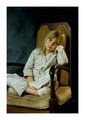
Just before bedby LonnieDComment by AVP: cclub
the picture has a serene feeling to it with a wonderful subject. However i feel it lacks a certain sharpness. The colors have a brown/yellow tint to them which clashes with the freshness of the subject. Also the chair has a really old feeling to it, which doesn't match too well with the subject. As has been mentioned, the white border is catching a lot (too much) of attention. While the subject is on a line within the rule of thirds, the cutoff of the knee distracts. A little more zoomed out could have worked better as it places her in a surrounding. A different chair (fitting with the subject), more upbeat lighting and sharpness would have made a top10 with such a nice subject imo. |
| Photographer found comment helpful. |
| 09/28/2010 05:38:55 AM |
Just before bedby LonnieDComment by NanaKofi: I love this portrait very very much. The ambience, the expression on her face, the simple clean lighting, the chair, the chair seems full of family history. |
| Photographer found comment helpful. |
| 09/27/2010 10:01:45 PM |
Just before bedby LonnieDComment by giantmike: Well done with the soft lighting and processing. I wasn't sure about the big white border at first, but with the subject, it does work. |
| Photographer found comment helpful. |
| 09/22/2010 07:16:56 AM |
|
| Photographer found comment helpful. |
Home -
Challenges -
Community -
League -
Photos -
Cameras -
Lenses -
Learn -
Help -
Terms of Use -
Privacy -
Top ^
DPChallenge, and website content and design, Copyright © 2001-2026 Challenging Technologies, LLC.
All digital photo copyrights belong to the photographers and may not be used without permission.
Current Server Time: 05/30/2026 02:50:32 PM EDT.