| Author | Thread |
|
|
10/05/2010 04:28:34 PM |
cclub
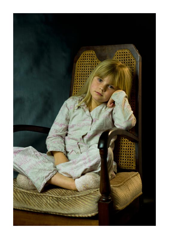
the picture has a serene feeling to it with a wonderful subject. However i feel it lacks a certain sharpness. The colors have a brown/yellow tint to them which clashes with the freshness of the subject. Also the chair has a really old feeling to it, which doesn't match too well with the subject. As has been mentioned, the white border is catching a lot (too much) of attention. While the subject is on a line within the rule of thirds, the cutoff of the knee distracts. A little more zoomed out could have worked better as it places her in a surrounding. A different chair (fitting with the subject), more upbeat lighting and sharpness would have made a top10 with such a nice subject imo. |
|
 Photographer found comment helpful. Photographer found comment helpful. |
Comments Made During the Challenge  |
|
|
09/28/2010 05:38:55 AM |
|
I love this portrait very very much. The ambience, the expression on her face, the simple clean lighting, the chair, the chair seems full of family history. |
|
| Photographer found comment helpful. |
|
|
09/27/2010 10:01:45 PM |
|
Well done with the soft lighting and processing. I wasn't sure about the big white border at first, but with the subject, it does work. |
|
| Photographer found comment helpful. |
|
|
09/22/2010 07:16:56 AM |
|
I don't like the border.. the image is wonderful. |
|
| Photographer found comment helpful. |
Home -
Challenges -
Community -
League -
Photos -
Cameras -
Lenses -
Learn -
Help -
Terms of Use -
Privacy -
Top ^
DPChallenge, and website content and design, Copyright © 2001-2026 Challenging Technologies, LLC.
All digital photo copyrights belong to the photographers and may not be used without permission.
Current Server Time: 06/29/2026 09:30:36 AM EDT.