| Image |
Comment |
| 04/30/2006 09:05:36 PM |
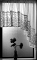
The vaseby trainComment by LalliSig: Good choice to make this b/w, I don´t think I would have liked it as much in color. |
 Photographer found comment helpful. Photographer found comment helpful. |
| 04/30/2006 08:21:18 PM |
|
| Photographer found comment helpful. |
| 04/30/2006 06:05:45 PM |
|
| Photographer found comment helpful. |
| 04/30/2006 05:25:27 PM |
|
| Photographer found comment helpful. |
| 04/30/2006 02:12:41 PM |
Ashleighby trainComment by fotomann_forever: ::: Greetings from Critique Club :::
Hi, as requested, here is an indepth critique of your submission.
First Impression - the most important one:
Lovely portrait, but a bit too much NI and a few stray hairs are distracting.
Composition:
Works well, and is pretty strong.
Subject:
Subject is clear and I love the eyes.
Technical (Color, focus, and light):
Color: Seems natural, it might have a bit of a blue cast to it (very little).
Focus is sharp.
Lighting works well for you and is very flattering to her skin.
To grow its vote?:
Neat image (or what ever noise reduction you used) seems a bit overdone. And voters are starting to not like that look.
Summary:
Lovely portrait, scale back your efforts to hide noise (skin blemishes) and you'll do well.
Hope to see more from you soon,
Leroy |
| Photographer found comment helpful. |
| 04/30/2006 11:17:31 AM |
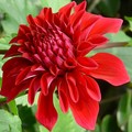
Dahliaby trainComment by szalona: very nice flora photo i usually odnt liek flora but i like this. good focus and fits the challenge. 9. |
| Photographer found comment helpful. |
| 04/30/2006 09:28:07 AM |
The vaseby trainComment by hanneke: your window is a bit tilted, but I like your choice of b&w! great contasts. |
| Photographer found comment helpful. |
| 04/30/2006 01:23:06 AM |
Dahliaby trainComment by bvoi: The red flower is dominating as the subject. That said, the challenge was complementary colors. Yes, green is present but not presented as an equal enough to compliment the red. This is just what popped into my head and may not be correct. Nice photo and choice of subject. |
| Photographer found comment helpful. |
| 04/29/2006 11:36:33 PM |
The vaseby trainComment by Melethia: Lovely! I really like this done in black and white. Some may say that you should move the vase slightly to the left but I find it very well balanced where it is, due to the shape of the curtain and positioning of the flowers. The only nit is the slope at the top of the window frame - this could be cropped just below it, or use post processing to correct the perspective. |
| Photographer found comment helpful. |
| 04/29/2006 11:07:30 PM |
|
| Photographer found comment helpful. |
Home -
Challenges -
Community -
League -
Photos -
Cameras -
Lenses -
Learn -
Help -
Terms of Use -
Privacy -
Top ^
DPChallenge, and website content and design, Copyright © 2001-2026 Challenging Technologies, LLC.
All digital photo copyrights belong to the photographers and may not be used without permission.
Current Server Time: 05/16/2026 02:57:39 AM EDT.