| Image |
Comment |
| 10/14/2009 10:34:59 PM |
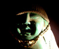
STEVEby jnix1asdfComment by dtremain: FWIW (probably not much) - lighting is too much. Try using a lesser light source, or moving it further away from the subject, or putting a filtering material between the source and subject (even a white piece of paper in front of the light will cut it a lot, but you can also use a white translucent piece of plastic - like a thin cutting board). At least you didn't do my mistake of camera too close and use the on-camera flash, with harsh front-on lighting and a very distinct shadow on the background. Interesting subject, and interesting use of the hat and necklace - the brown contrast with the green of the statue. Keep playing around with it, try different things and see what you like. |
| 10/13/2009 04:46:14 PM |
STEVEby jnix1asdfComment by bvy: Not sure I'd call it low key. Startling and original all the same. |
| 10/11/2009 03:18:54 PM |
|
| 10/08/2009 07:38:32 PM |
STEVEby jnix1asdfComment by dustingooding: Meets Challenge: 2 of 3. This is really borderline for me. The super bright lower corner is almost too much.
Technical: 1 of 3. Lower right is way overblown, and it feels as though the whole image is out of focus.
Emotion: 1 of 3. I like the little cap, makes the otherwise rigid statue a little more whimsical. But otherwise, it's just not doin' it for me.
Awe: 0 of 1. |
| 10/08/2009 06:55:42 AM |
|
| 10/08/2009 01:50:22 AM |
STEVEby jnix1asdfComment by ASTONishing: the white light is very harsh. You could try diffusing it with a piece of paper. You could also try moving the light source slighty more forward of the subject.
The subject also seems a bit out of focus. |
| 10/07/2009 04:47:20 PM |
|
| 10/06/2009 09:22:29 AM |
vortexby jnix1asdfComment by glad2badad: Oh boy. Sorry, but I'm not finding this very appealing. I can appreciate a good blur, light trail shot in an abstract presentation, but this just appears chaotic. |
| 10/01/2009 09:56:22 AM |
vortexby jnix1asdfComment by Jaded_Housewife: *not voting as I'm in this challenge-just commenting since I've seen requests for comments in the challenge thread*
Very nice colors. The compositons not working for me and seems like it could probably use a bit more contrast too though.
HTH |
 Photographer found comment helpful. Photographer found comment helpful. |
Home -
Challenges -
Community -
League -
Photos -
Cameras -
Lenses -
Learn -
Help -
Terms of Use -
Privacy -
Top ^
DPChallenge, and website content and design, Copyright © 2001-2026 Challenging Technologies, LLC.
All digital photo copyrights belong to the photographers and may not be used without permission.
Current Server Time: 07/03/2026 08:04:35 AM EDT.