| Image |
Comment |
| 08/19/2003 03:51:33 AM |
|
| 08/17/2003 04:54:56 AM |
|
| 08/17/2003 12:51:31 AM |
|
| 08/15/2003 11:01:35 PM |
|
| 08/15/2003 10:52:10 PM |
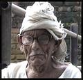
Old and Dejectedby DreamerComment by ttreit: I see quite a few jaggies, especially along his shoulders adn the rail above. Seems like the picture might have been fuzzy and then was oversharpened to compensate. His hat and shirt both seem overexposed to me. |
| 08/15/2003 05:00:20 AM |
|
| 08/14/2003 12:36:55 AM |
|
| 08/13/2003 10:20:31 AM |
|
| 08/13/2003 09:36:07 AM |
|
| 08/13/2003 07:33:54 AM |
Old and Dejectedby DreamerComment by asitv: Although a good composition, but the image is little out of focus. The brightness is on the higher side and contrast does'nt seem right. Maybe a fill-in-flash would have removed the dark shadows from the image and have made it much better.
DOF ... what happened to it.... considering that you wanted to highlight the background. Overall the picture is little weak in clarity and focus but I guess a B/W / sephia tone of the same image would have looked better. |
Home -
Challenges -
Community -
League -
Photos -
Cameras -
Lenses -
Learn -
Help -
Terms of Use -
Privacy -
Top ^
DPChallenge, and website content and design, Copyright © 2001-2026 Challenging Technologies, LLC.
All digital photo copyrights belong to the photographers and may not be used without permission.
Current Server Time: 07/15/2026 01:31:33 PM EDT.